Link copied to clipboard
.jpg)
Some products are allowed to be a little rough around the edges. A task manager that's clunky, a recipe app with a confusing filter. Annoying, sure, but low stakes. Users shrug and move on.
But some products sit inside moments that are anything but low stakes. A person tracking their cycle after a miscarriage. Someone logging symptoms they've been dismissed about for years. A new parent making decisions about their child's health at 2am. These aren't casual interactions, and the people having them aren't in a neutral headspace.
When a product touches women's health, reproductive care, or family wellbeing, the design decisions you make carry real weight. Not because users are fragile, but because the moments they're in are significant. And that changes everything about how you need to show up for them.
Not every user arrives at your product in the same headspace. Some are browsing. Some are stressed, scared, or carrying something heavy. That difference matters.
A user is in a vulnerable state when the interaction carries weight beyond the screen. When they're sharing sensitive health information. When the outcome of the experience actually matters to their life. When they have less power in the relationship than the product does, because the product holds their data, their history, or access to something they need.
In women's health and femtech, these moments show up constantly. And they don't always look dramatic.
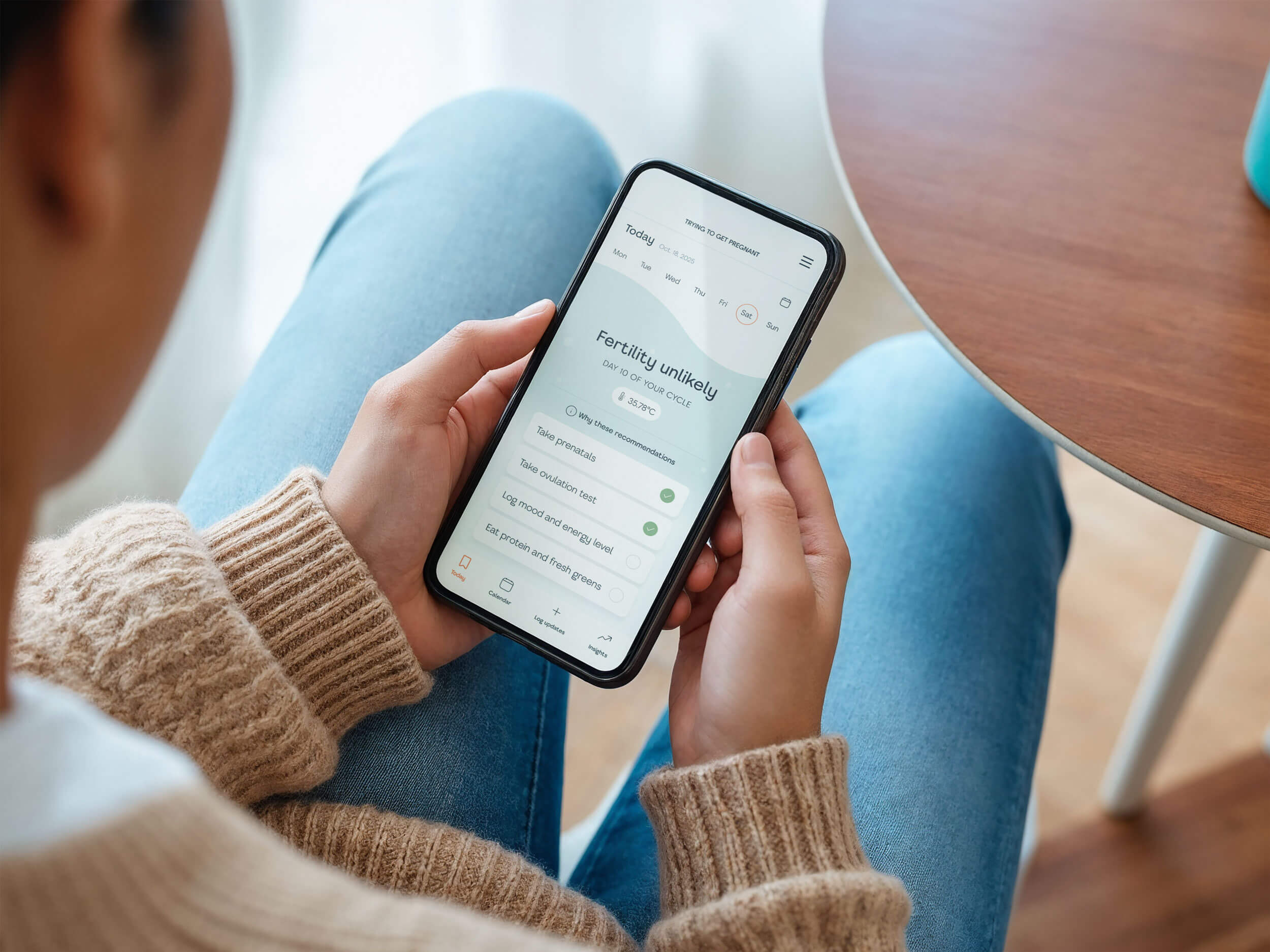
A friend recently went through this firsthand. She was researching a fertility tracking device, a fairly significant purchase, because she wanted deeper insight into her hormonal health while trying to conceive. She already had a child. She wasn't facing a crisis. She just wanted more information.
But the app's onboarding didn't have room for her. It assumed she was either starting completely from scratch or navigating something like IVF or pregnancy loss. Nothing in between. No path for someone who simply wanted to understand her body better. She didn't feel seen. She felt like her situation didn't qualify.
That's what a vulnerable moment looks like in the real world. Not always grief or fear, sometimes it's just a person trying to do something hopeful, and a product that makes them feel like they got it wrong before they even started.
Women have a complicated relationship with healthcare. Not because we're difficult, but because the system has given us good reasons to be skeptical. Symptoms dismissed. Pain minimized. Conditions that disproportionately affect women taking decades longer to research and diagnose. That history doesn't disappear when we download an app.
When we turn to a femtech or female health product for support, we're often doing it because the traditional system let us down. We're not starting from neutral. We're starting from a place of "I hope this is different."
That's a lot to carry into an onboarding flow.
And the stakes around data make it even more layered. Reproductive health information is among the most sensitive data we can share.
Who has access to it, how it's stored, and what it could be used for are questions we're increasingly aware of and worried about. If your product doesn't address those concerns clearly and early, you're not just losing trust. You're confirming a fear we already had.
Many of us also arrive already managing something hard. Uncertainty about a diagnosis. Grief after a loss. Fear about what a symptom might mean. We're not in a casual browsing mindset. We're looking for something that will actually help, and we're paying close attention to whether your product feels safe enough to let in.If it doesn't, we won't just leave. We'll tell people.
Respecting your users doesn't require a complete product overhaul. It shows up in the small decisions, the ones that are easy to overlook when you're moving fast and trying to ship.
It starts with language. Many femtech founders are doctors, researchers, or work closely with clinical teams. The language they use internally is technical because that's the world they live in. And there's a real tension there: they want to sound science-backed and credible, because they are, but clinical language creates distance between the product and the person using it. The goal isn't to dumb things down. It's to communicate that you're rigorous and trustworthy while still sounding like a human talking to another human. Women navigating their health shouldn't need a medical degree to feel confident using your app.
Then there's the feature trap. A lot of founders believe that more features means more value. But users don't experience features, they experience whether the product solves their problem. Features are the result of understanding user needs, not the starting point. When a product is built around a feature list instead of real human needs, it shows. Things feel cluttered, disconnected, and hard to navigate.
Which brings us to flow. The order in which you present information and ask for things isn't arbitrary. It should mirror how your users actually think, the sequence in which their questions and concerns naturally arise. When it doesn't, the cognitive load piles up fast. Users feel confused and overwhelmed before they've even gotten to the part where your product could actually help them. Structure your flow around what your user needs first, then second, then third. Not around how you make decisions.
Privacy controls matter too, and not just because they're required. When a user can actually see and understand how their data is being used, without having to dig through settings or decode legal language, it tells them you thought about their peace of mind. Burying privacy options or making them confusing doesn't just frustrate users. It confirms their fears.
Onboarding is another moment that's easy to get wrong. Asking for sensitive information before you've explained why you need it puts users on the defensive immediately. A simple explanation before the ask, "We need this so we can personalize your experience," changes the dynamic entirely. You're inviting someone in rather than extracting information from them.
And don't forget the moments when things go wrong. Error states and empty states are often afterthoughts, but for a user in a vulnerable moment, a tone-deaf error message can feel genuinely awful. A cheerful "Oops!" on a health tracking error isn't charming. It's dismissive.
Finally, inclusive design isn't a nice-to-have in this space. It's the whole point. If your product only works for one body type, one family structure, or one version of a woman's life, you're not designing for real life. You're designing for an assumption.
No founder sets out to build a product that makes users feel bad. But good intentions don't automatically translate into good design, and in women's health and female health tech, the gap between intention and experience can do real damage.
One of the most common failures is collecting data faster than you've built trust. Asking for deeply personal information before a user has any reason to feel safe with your product doesn't just feel invasive. It stops people in their tracks. You haven't earned that yet.
Tone is another place things go wrong, and it's often invisible to the team building the product. A cheerful, casual voice might feel friendly in a lifestyle app. In a femtech product where someone is tracking a health condition, managing fertility, or processing a difficult diagnosis, that same tone can feel completely out of place. A breezy "Oops, something went wrong!" on a health tracking error isn't relatable. It's dismissive.
Then there's the assumption that all users are navigating your product from the same circumstances. Not every user has privacy at home. Not every user has reliable internet access, the same level of health literacy, or the same support system. When products are built only for the easy, uncomplicated version of a user's life, the people who need them most are often the ones left behind.
And finally, building for the happy path. Most products are designed around the ideal user journey, everything goes smoothly, the user knows exactly what they're doing, nothing unexpected happens. But in women's health, the edge cases aren't rare. They're just less comfortable to design for. The user who gets an unexpected result. The one who needs to stop and come back later. The one whose situation doesn't fit neatly into your predefined categories. Those moments deserve as much design attention as everything else.
None of this is about perfection. Founders building in the women's health and femtech space are solving hard problems, often with small teams and limited resources. That's real, and it matters.
But intention isn't enough. The women using your product are bringing their full history with them, their frustrations with a healthcare system that has often let them down, their very real concerns about data privacy, and in many cases, something deeply personal they're navigating alone. They're paying attention to every signal your product sends.
The question isn't just "does this work?" It's "does this work for her, in her real life, at her most vulnerable?"
That's what responsible design actually means. And it starts long before launch, in the language you choose, the flow you build, the edge cases you decide are worth designing for. Every one of those decisions is either building trust or quietly eroding it.
If you're not sure whether your product is earning the trust of your users, that's worth looking at. Send me a DM and let's talk about what a trust audit could uncover for your product.
.jpg)