Link copied to clipboard
You’ve seen it before: another femtech brand wrapped in pink, paired with minimalist fonts, and maybe a tagline about empowerment. It’s well-intentioned, but it often misses the mark.
Femtech has become one of the most innovative corners of health tech, yet also one of the most visually repetitive. Founders designing for female bodies face a tricky balance: how do you create a brand that feels approachable without feeling trivial, credible without being cold, and inclusive without losing focus?
Femtech isn’t just about women. It’s about people with female bodies, and that nuance matters. Language, colour, and tone all influence who feels seen, safe, and welcome in your product.
This isn’t just a colour debate. It’s about redefining what care, confidence, and credibility look like in an industry that’s been painted with the same brush for too long.
Before femtech even existed, pink had already been assigned a role. Decades of marketing taught us that pink means “for girls” and blue means “for boys.” It was never a natural association, just a convenient way for brands to categorize audiences (and sell more!).
When femtech first emerged, pink was used as a declaration. In an industry dominated by blue, grey, and white, pink signaled difference. It said, “This product is for women.” For founders trying to make women’s health visible, that felt like progress.
At the time, it worked. Pink stood out against the masculine visual codes of medicine and tech. It made taboo topics like fertility, periods, or sexual wellness feel softer and more approachable. It told users, “You’re not alone.”
But somewhere along the way, pink stopped being a statement and started being a stereotype. It became less about connection and more about assumption. Instead of reflecting the diversity of people with female bodies, it flattened their experiences into a single aesthetic.
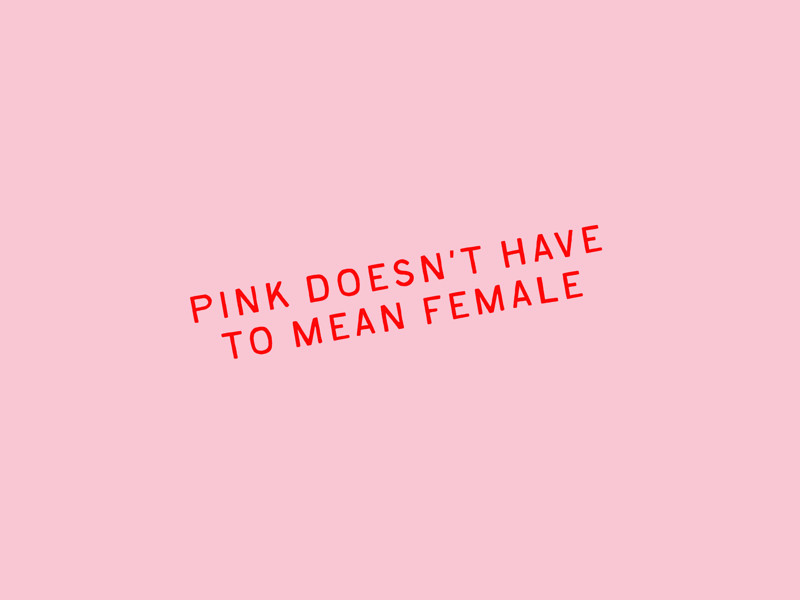
Pink isn’t the problem. It’s the pattern. The issue isn’t using colour, it’s relying on the stereotypical meaning behind it. When pink becomes shorthand for “female,” it turns a powerful design choice into an outdated assumption.
Designing for female bodies today means breaking that pattern and expanding what “women’s health” even looks like and who it’s really for. Not everyone who uses a femtech product identifies as a woman, and not everybody with a female body wants to fit into the pink, polished box that marketing has built for them.
Inclusive branding moves beyond gendered cues and focuses on what truly matters: creating experiences that feel safe, trustworthy, and human for everyone your product serves.
As the industry grew, femtech brands began to fall into familiar patterns. Some tried to look comforting, others tried to look credible, and a few tried to look revolutionary. Each approach made sense on paper, but when taken too far, they became traps, repeating the same narrow ideas about what “female health” should look and feel like.
Below are the three most common branding traps and how to move beyond them.
This is where good intentions meet old assumptions. Founders want their product to feel warm and approachable, so they reach for pink. But when pink is used as a symbol of femininity rather than a strategic design choice, it simplifies identity and limits expression.
What to do instead:
Choose colour intentionally, not symbolically. Think about how you want users to feel: calm, confident, reassured, empowered. Use tone, typography, and texture to communicate emotion rather than relying on colour stereotypes.
In an effort to appear credible, many brands adopt sterile palettes, minimal layouts, and overly technical language. It works for investors and healthcare partners, but it can alienate users who need empathy as much as evidence.
What to do instead:
Blend credibility with warmth. Use precise language without losing your human voice. A clean, structured interface can coexist with inviting imagery, inclusive photography, and copy that sounds like care rather than instruction.
Some brands swing the other way and embrace bold fonts, loud taglines, and manifesto-style messaging. The intention is strength, but it can feel performative or even intimidating to users who simply want reliable support for personal health needs.
What to do instead:
Show empowerment through experience, not volume. Confidence can live in small details: clear onboarding, affirming language, inclusive visuals, and frictionless usability. True empowerment comes from how your brand makes people feel capable and understood.
Trust is built through honesty and authenticity. Belonging is built through care. In femtech, both matter equally. A brand that feels too clinical may earn trust but struggle to connect emotionally. A brand that feels too soft may build comfort but lose authority. The real challenge is designing at the intersection of both.
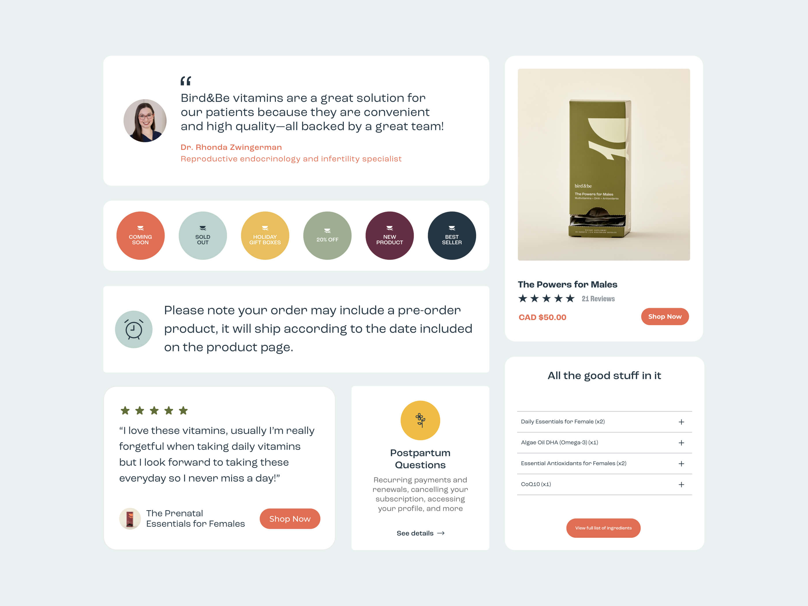
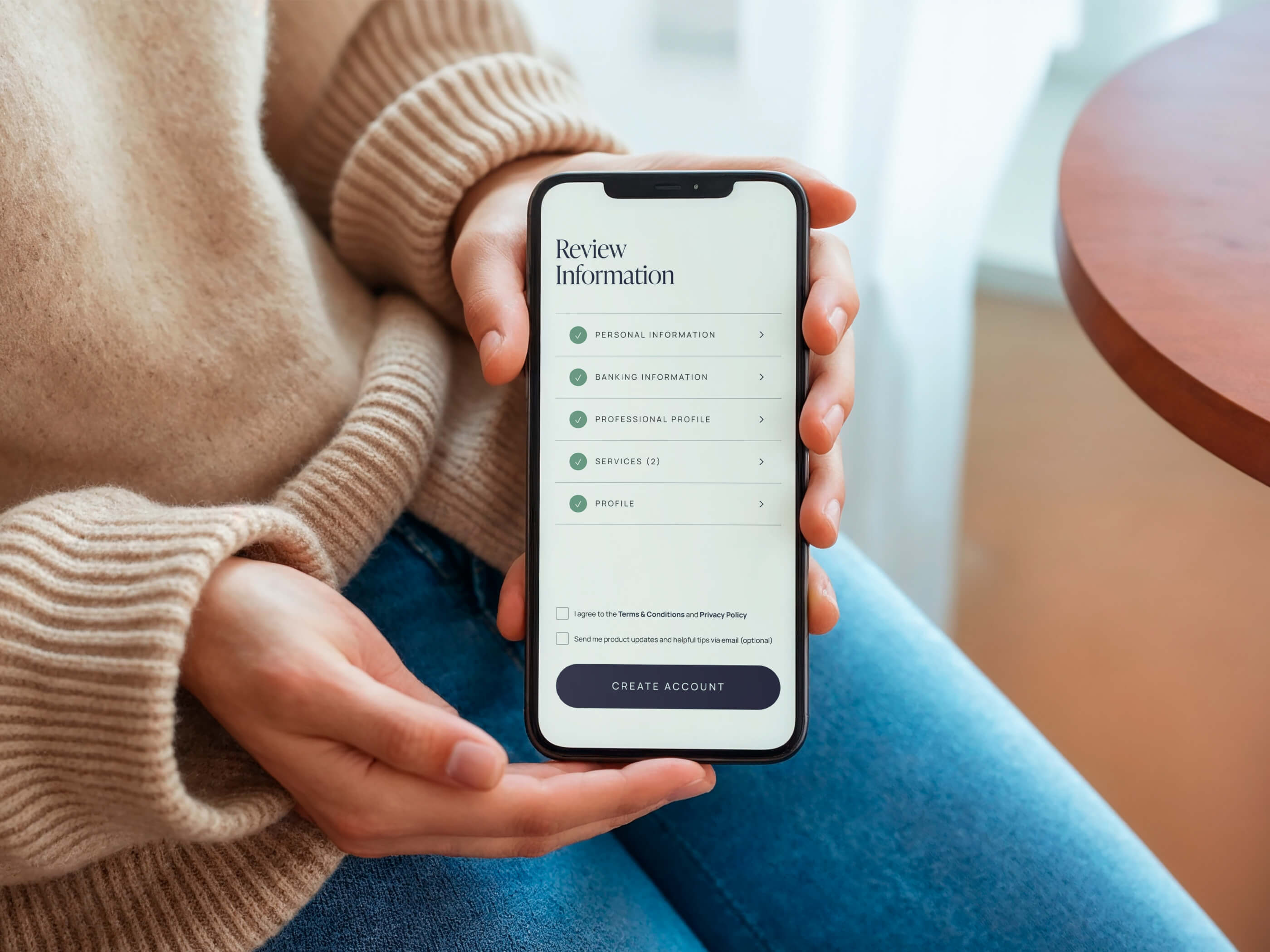
When we rebranded Bird&Be, that balance was already part of their DNA. Their mission to make conception and pregnancy care more accessible was clear, compassionate, and grounded in science. They didn’t fall into any of the common traps. The foundation was strong. Our work focused on building on that strength and evolving how it showed up visually.
The logo stayed the same, but everything around it matured. We refined the colour palette to move away from the overly medical tones common in the category, introducing warmer neutrals and accents that felt modern yet grounded. The typography became friendlier without losing structure. The language softened too, informative enough to be credible but conversational enough to sound human.
Every touchpoint, from the website to the packaging, was designed to feel like a brand that understands both science and sensitivity. Because fertility isn’t just data and diagnostics. It’s emotional, personal, and often overwhelming. Bird&Be needed to look and sound like a trusted companion, one that treats users as equals, not patients.
That’s what belonging looks like in design. It’s not just about aesthetics or tone. It’s about creating a brand environment where people feel seen, informed, and respected, wherever they are in their journey.
Every femtech brand sits somewhere between science and emotion, structure and sensitivity. Finding your place in that spectrum starts with asking better questions. These reflections help uncover what your brand truly needs to communicate before you even open a design file.
1. What emotion do you want people to feel first?
Relief, trust, curiosity, hope, empowerment? Each feeling leads to a different tone and visual direction. The answer should come from your users’ reality, not your competitors’ aesthetics.
2. Who are you really designing for?
Are your primary users people with female bodies, healthcare providers, or both? Not everyone who benefits from femtech identifies as a woman. Being clear about your audience helps you design language and visuals that feel inclusive, not assumptive.
3. What role does your brand play in your users’ lives?
Are you a coach, a companion, or a clinician? Your tone of voice, colour choices, and visual structure should support that relationship.
4. How should your brand balance empathy and authority?
A credible brand doesn’t need to sound distant. A caring brand doesn’t need to sound soft. Think about how your copy, layout, and typography can hold both.
5. What does trust look like for your users?
For some, it’s clean design and scientific backing. For others, it’s community, transparency, and accessibility. Trust is emotional first and rational second.
These questions don’t have right or wrong answers. They’re a way to align your brand with intention so your design choices feel grounded, inclusive, and true to the experience you want to create.
A femtech brand isn’t static. As your product evolves from idea to MVP to a growing platform, your brand needs room to evolve with it. The goal is not to build a perfect brand from day one, but to create a system that can stretch, adapt, and mature as your users and offerings expand.
One of the biggest issues I see with early-stage brands is that scalability isn’t part of the conversation. For example, your colour palette might look beautiful at launch, but it can quickly become limiting once you introduce new product lines or add more features to your interface. Colours and icons can act as identifiers for different parts of your product, but if your system isn’t built with flexibility in mind, you’ll end up layering on more and more visual elements until it becomes a mess.
That’s why having a solid foundation matters. You can’t predict every future scenario, but you can leave room for growth. Thinking about scalability early on makes it much easier to evolve from a simple MVP to a multi-product ecosystem.
When we rebranded Bird&Be, for example, we expanded their colour palette intentionally. The original palette was starting to limit the packaging design, so we introduced additional colours and created a structure for how to use them as new products were added. Instead of endlessly adding new hues, we used shades and pairings within the existing palette. It gave Bird&Be room to grow while keeping everything cohesive and recognizable.
A scalable design system doesn’t mean overcomplicating things, it means thinking ahead. A little flexibility built into your foundation will save you from chaos later on.
Think of your brand as a living framework, not a finished product. The details may change, but the foundation of care, honesty, and inclusivity should always stay the same.
Pink isn’t the enemy. Neither are bold fonts or clinical layouts. The problem starts when design choices are made by assumption rather than intention.
Femtech has the power to reshape how we experience care, but that begins with rethinking how it’s represented. When branding reflects the real lives of people with female bodies, rather than relying on gendered cues, it becomes more than design, it becomes connection.
The goal isn’t to reject pink or softness or science. It’s to use them intentionally. To make decisions that serve the people you’re designing for, not the stereotypes attached to them.
A thoughtful femtech brand makes users feel safe, informed, and respected. It communicates empathy without losing authority. It scales without losing itself. And most importantly, it tells users, “We see you,” in a world that often doesn’t.
That’s what it means to brand with intention.