Link copied to clipboard

Here's the uncomfortable truth: your users are terrified of giving you their data.
And honestly? They should be. Between data breaches, shady third-party selling, and algorithms that seem to know too much, trust is at an all-time low. For women and families especially, the stakes feel higher. They're not just protecting themselves—they're protecting their kids, their health information, their home addresses.
But here's the thing: you need data to build a product that actually works. You can't personalize experiences, improve features, or solve real problems without understanding your users. So how do you collect what you need without triggering that "this feels creepy" alarm?
The answer isn't just a better privacy policy. It's designing transparency into every interaction.
Most apps treat data collection like a transaction: "We need your email address. Accept or leave."
But trust is built on context. Your users need to understand why you're asking and what's in it for them.
Instead of: "We collect your location."Try: "We use your location to find pediatricians within 10 miles of you—so you're not scrolling through doctors across the country."
See the difference? One feels like surveillance. The other feels like service.
This approach works for everything. Asking for birth dates? Explain it's for age-appropriate content recommendations. Need access to their calendar? Tell them it's to avoid scheduling conflicts with their existing appointments.
When you connect the data to a tangible benefit, it stops feeling invasive and starts feeling collaborative.
Transparency isn't just about disclosure—it's about visibility.
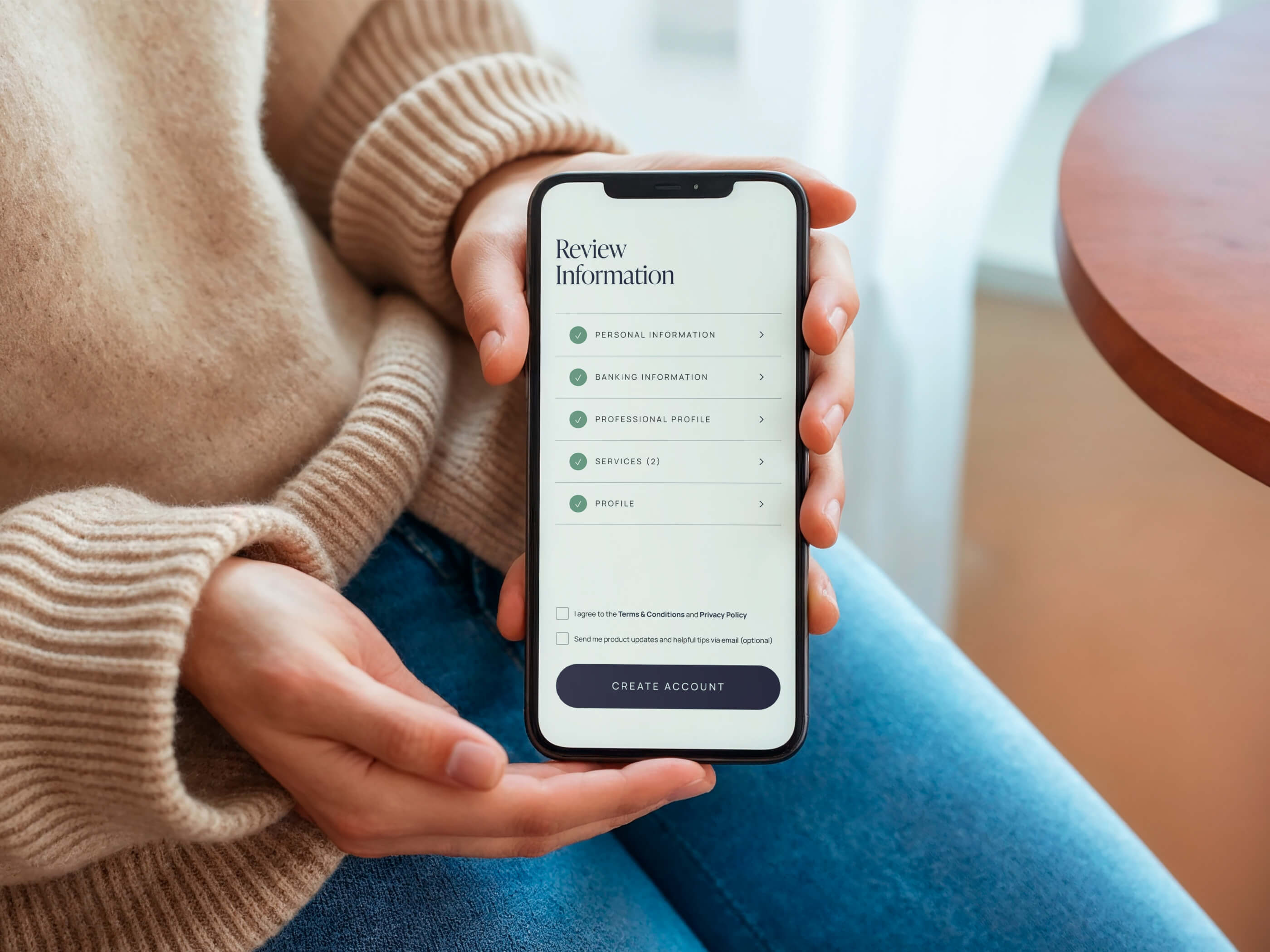
Build a simple "My Data" page where users can see exactly what information you've stored about them. Think of it like showing someone the receipt. It's proof that you're not hiding anything.
This doesn't need to be complicated. A basic list works:
Bonus points if you let them download their data as a file. It signals that they own it, not you.
I've seen startups hesitate here, worried that users will freak out seeing how much data exists. But the opposite is true. When people can see their data, they feel in control. When they can't, they assume the worst.
If users have to email support, submit a ticket, or dig through seven layers of settings to opt out of data collection, they'll assume you're trying to trap them.
And they're not wrong.
Real transparency means real control. One-click toggles for every data type. Clear labels. No dark patterns that trick people into staying opted in.
Here's the gold standard:
No pre-checked boxes. No "are you sure?" pop-ups designed to guilt them. Just straightforward choices.
Yes, fewer people might opt in. But the ones who do will trust you more. And trust converts better than coercion ever will.
Your users don't speak tech. When you say "AES-256 encryption" or "SOC 2 compliant," their eyes glaze over.
Translation is trust-building.
Instead of technical jargon, try:
Notice how these statements are concrete, specific, and reassuring? That's what builds confidence.
Also, don't bury this stuff in a 40-page privacy policy. Put it where users can see it—right on the sign-up page, in your app footer, in confirmation emails. Make security visible.
This is where most companies lose trust.
You might not sell data directly, but if you use analytics tools, payment processors, or marketing platforms, third parties are involved. And your users deserve to know.
Don't hide behind vague language like "trusted partners." Be specific:
When you're upfront about who sees what, users can make informed decisions. Ambiguity breeds suspicion.
Before you implement any data collection feature, ask yourself: Would I be comfortable with my own data being handled this way?
If you wouldn't want a fertility tracking app storing your cycle data indefinitely, don't do it to your users. If you'd be uncomfortable with a parenting app sharing your kid's information with advertisers, don't build that feature.
Women and parents are especially attuned to these signals. They've been burned before. They're protective—not paranoid. And they can smell inauthenticity from a mile away.
I know what you're thinking: "This sounds like a lot of work just to collect basic data."
But here's what I've seen again and again with startups building for women, femme users, and families: trust is your conversion bottleneck.
You can have the best product in the world, but if people don't trust you with their data, they won't sign up. And if they do sign up but feel uneasy, they won't stick around.
Transparent data collection isn't a nice-to-have. It's a competitive advantage.
When users feel safe, they engage more. They invite their friends. They become advocates. Trust compounds.
So yes, it takes intentionality to design transparency into your product. But the alternative—a leaky funnel of suspicious users who bounce before you can prove your value—costs you far more.
Build trust into every interaction. Your users will notice. And they'll reward you for it.
--------
P.S. If your product is struggling with trust issues—low conversions, high bounce rates, or users who sign up but never come back—it might be a design problem, not a product problem. At Random Pattern Studio, I help startups building for women, femme users, and families create brand and UX/UI experiences that build trust from the first click. Book a discovery call and let's talk about what's possible for your product.

.jpg)
