Link copied to clipboard
You know that feeling when your Shopify dashboard shows amazing conversion rates, but three months later, most of those customers haven't come back? Yeah. That's the DTC wellness paradox nobody wants to talk about.
Here's what's happening: Your site is gorgeous. Your product photography is chef's kiss. Your Instagram aesthetic is on point. People are clicking "add to cart" and actually checking out. But then... crickets. They buy once, maybe leave a nice review, and disappear. Your carefully crafted email flows get ignored. Your subscription offers get declined. And you're left wondering what went wrong.
Here's the thing: nothing went wrong with your product. What went wrong is that your entire brand experience was designed to get someone excited enough to buy, not to actually use what they bought. And in wellness? If they don't use it, they definitely don't reorder it.
Most DTC wellness brands are designed like impulse purchases. Think of those TikTok-viral skincare products or the supplement that every influencer is suddenly promoting. But you're not selling an impulse buy. You're selling something that requires commitment, consistency, and real behavior change. That cute packaging gets them to checkout. But it doesn't get them to Week 6 when the initial excitement has worn off and they're deciding whether to reorder.
The real business isn't in that first purchase. It's in the repurchase. That's where you actually become profitable. That's where customers become advocates. That's where your brand survives.
So let's talk about how to design your brand (from your website to your emails to your packaging) for the long game, not just the dopamine hit of checkout.
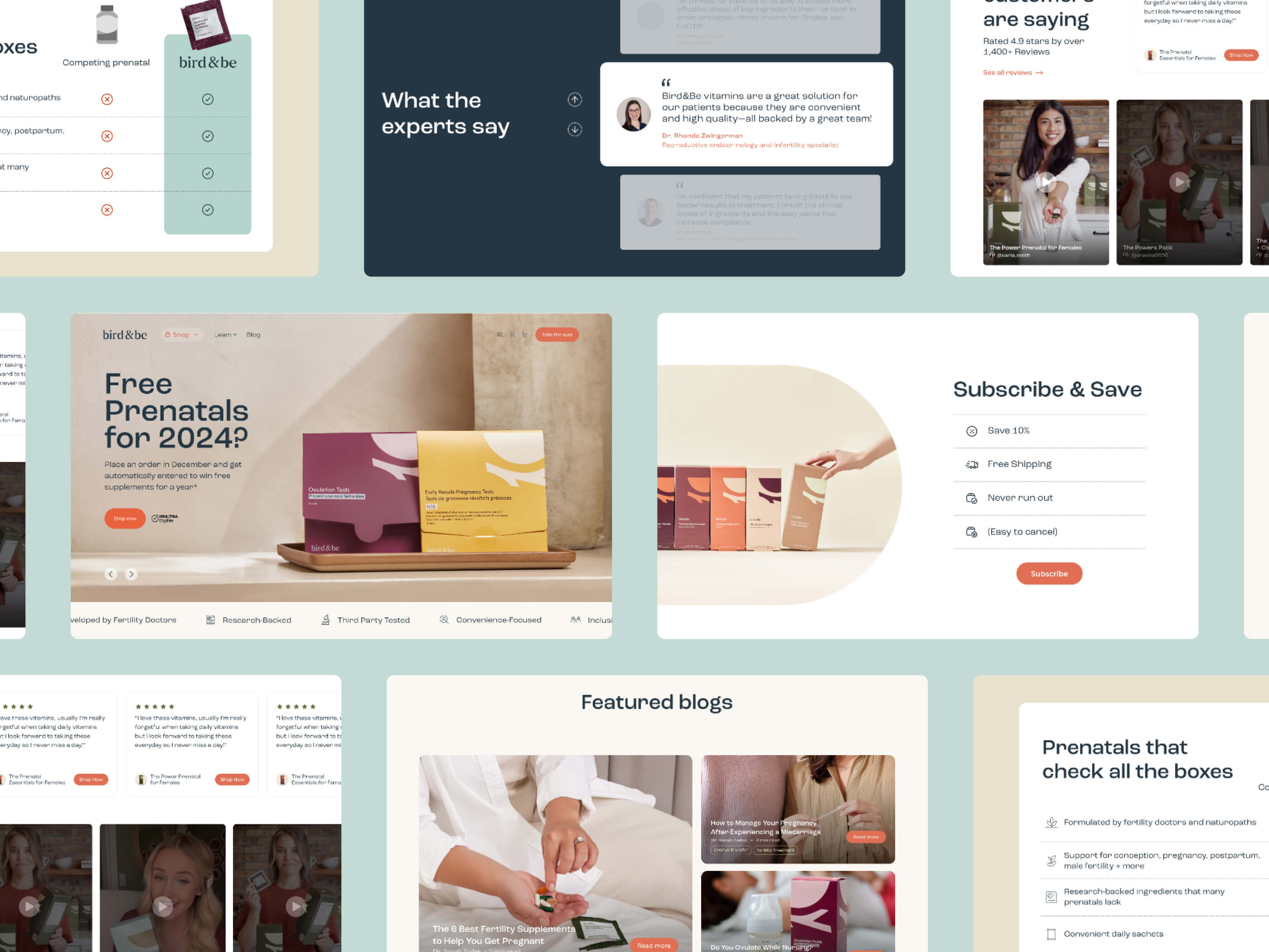
You've probably spent hours perfecting your product pages. The lifestyle photos show your ideal customer in her best light, living her best life. The copy promises transformation. The testimonials are glowing. Every element is optimized for one thing: getting that visitor to click "buy now."
And it works! Your conversion rate is solid. People are buying.
But here's what happens next: The product arrives. Real life happens. Your customer opens the package between meetings, or while the kids are fighting over the iPad, or at 9pm when she finally has a minute to herself. The product is great, but it's not the transformative moment your website promised. It's just... a thing. A thing she now needs to figure out how to actually use in her already overscheduled life.
The gap between the promise on your site and the reality of daily use? That's where you lose customers.
Let's talk about that pop-up or checkout offer: "Subscribe and save 15%!" It seems like a no-brainer for building predictable revenue, right? Except you're asking someone to commit before they've even tried your product. Before they know if it works for them. Before they've proven to themselves that they can stick with it.
Your customer might be thinking: "What if I don't like it? What if I forget to use it? What if I can't figure out how to cancel?" You're asking for trust you haven't earned yet. And for women especially, who are often managing household budgets and purchases for their entire family, that premature commitment feels risky.
Here's the customer journey for most DTC wellness brands: excited purchase, shipping confirmation email, product arrives, maybe a "how did we do?" review request a week later, then radio silence until you're pushing a sale or asking them to reorder.
Meanwhile, your customer's experience looks like this: Product arrives. She's excited. She uses it once or twice. Life gets busy. The product sits on her bathroom counter or in her kitchen cabinet. She feels a little guilty every time she sees it. She definitely doesn't want to buy more of something she's not even using. Eventually, she either forgets about your brand entirely or actively avoids your emails because they make her feel bad about herself.
Here's the truth that's hard to hear: Your customer isn't abandoning your product because it doesn't work. She's abandoning it because she never started using it properly. And that's a design problem, not a product problem. You got her to buy, but you didn't help her integrate your product into her actual, messy, complicated life.
Think about how much time and money you've spent on your product pages. Now think about what happens after someone clicks "complete order." If the answer is "not much," that's your problem.
The sale isn't the finish line. It's the starting line for actually keeping that customer. And this is where most wellness brands completely drop the ball.
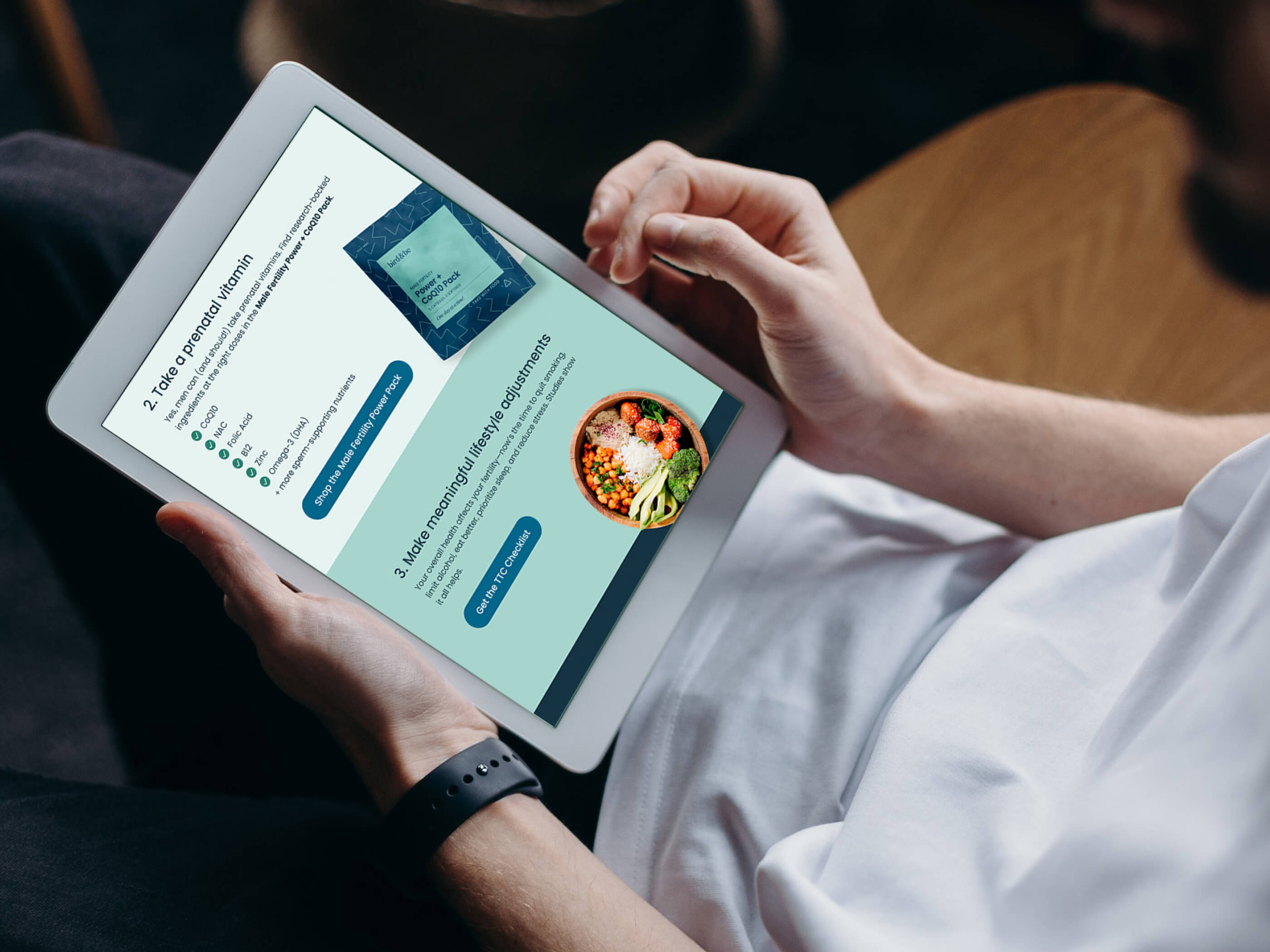
Here's what retention-focused design looks like: Your welcome email doesn't immediately try to upsell or cross-sell. Instead, it focuses on helping your customer actually use what she just bought. It acknowledges that starting something new is hard. It gives her a simple, realistic plan for integrating your product into her life (not a 12-step morning routine that requires waking up at 5am).
Your onboarding emails are timed to when the product actually arrives, not just when the order was placed. "Your supplements should be delivered today! Here's the easiest way to remember to take them tonight" works so much better than a generic "thanks for your order" sequence.
Real example: Imagine you sell a supplement. Instead of sending day-after-purchase upsells, you send a "Week 1 Reality Check" email that says something like: "Hey, we know it's hard to remember to take something new. Most of our customers find it helps to put the bottle next to their coffee maker or set a daily phone reminder. Pick one spot and stick with it." You're designing for the reality that building a new habit is hard, and you're helping instead of selling.
Women research the hell out of products before buying, especially wellness products. We're reading ingredients. We're checking reviews on multiple sites. We're asking their friends. We can spot BS a mile away, and overpromising will absolutely kill your credibility.
This is where designing for trust means doing something counterintuitive: being honest about what your product won't do and who it's not for.
A skincare brand that includes a "This might not be for you if..." section on each product page might seem like conversion rate suicide. But here's what actually happens: The customers who do buy trust you more. They feel like you're being straight with them. They're more likely to actually use the product correctly because you set realistic expectations. And they're way more likely to come back and buy again.
The same goes for timelines. "Most customers see results in 6-8 weeks" is so much better than "Transform in 7 days!" Even if the second one drives more initial sales, the first one drives repurchase because customers know what to expect.
Transparency also means making your customer service accessible and real. Not just a chatbot that can't actually help. Not a "contact us" form that disappears into the void. Real humans who respond quickly and actually solve problems. This is especially important for health and wellness products where customers have real questions and concerns.
The first few days after purchase? Your customer is motivated. She's excited. She uses your product religiously.
Fast forward two weeks. The novelty has worn off. She forgot to use it yesterday. And the day before. She's feeling guilty but also like maybe it's not working anyway? This is the danger zone. This is where most customers decide whether to stick with your product or let it collect dust.
If your brand goes silent during this period, you've basically given up on retention.
Smart retention design means checking in at the critical drop-off points. A Day 7 email that says "How's it going?" with actually helpful content, not just a sales pitch. A Day 21 text that acknowledges the motivation dip and offers a quick tip or encouragement. A Day 45 email that shares what real customers experienced at this stage.
Even better? Include content that normalizes the struggle. "Feeling like quitting? Here's why Week 3 is the hardest" or "Real talk: Most people hit a wall around now. Here's how to push through." You're designing for the emotional reality of behavior change, not just the functional reality of using a product.
Community features help too. User-generated content that shows real people (not influencers) sticking with your product. A simple hashtag campaign. Customer stories in your emails. Anything that makes your customer feel less alone in the messy middle.
Your customer is busy. She's managing work, kids, a household, her own health, maybe aging parents. She has seventeen thousand things on her mental to-do list. Remembering to reorder your product? It's not high on that list, even if she loves it.
This is where design can save the sale.
Predictive reminders that are actually smart: "You're probably running low" sent 5 days before a 30-day supply runs out, based on when she actually ordered, not some arbitrary email sequence. Include the estimated delivery date so she knows it'll arrive before she runs out.
One-click reorder from the email. Don't make her log into your site, navigate to her account, find her order history, and manually add items to cart. That's too many steps for someone who's deciding between your product and the seventeen other things she needs to do right now.
If you offer subscriptions, make them genuinely flexible. Easy to pause, skip, or modify without feeling like she's navigating a maze designed to trap her. No dark patterns. No making her call customer service to cancel. No "are you sure?" guilt trips. Women talk to each other, and they definitely talk about brands that make it hard to cancel subscriptions.
Your account dashboard should be simple and useful. Order history that's easy to scan. Clear options to reorder, modify, or pause. No clutter. No aggressive upsells. Just helpful tools for someone who wants to keep being your customer.
Let's talk real numbers for a second. You're probably spending anywhere from $50 to $150 to acquire a single customer through ads, influencer partnerships, or other marketing channels. That first purchase? After product costs, shipping, and payment processing, you might net $20 to $40 in profit. Maybe less.
Do the math. You're losing money on that first sale.
You don't actually become profitable until the second or third purchase. This isn't a nice-to-have. This is literally how your business survives. Every customer who buys once and disappears is money down the drain. Every customer who reorders is where you actually build a business.
Retention-focused design isn't about being nice or customer-centric (though it is those things). It's about basic business economics. The brands that figure out how to keep customers are the ones that can actually afford to grow.
And here's the bonus: Long-term customers become your best marketing channel. They tell their friends. They post about your products without you asking. They leave detailed, helpful reviews. They become the social proof that drives your organic acquisition. Which means lower CAC over time. Which means better unit economics. Which means a business that actually works.
Let's talk about two profit killers: returns and subscription cancellations.
Returns happen when expectations don't match reality. When your site promised miracles and delivered a regular product. When your customer didn't understand how to use what she bought. When she felt misled. Better onboarding and honest product pages mean fewer "I never used it" returns sitting in your warehouse.
Then there are the subscription cancellations. Not the thoughtful "this isn't working for me" cancellations. The angry ones. The ones where your customer feels trapped or tricked. Where she couldn't easily pause or skip. Where she got charged when she wasn't expecting it. Where canceling required calling customer service or navigating through guilt-trip pop-ups.
Those rage cancellations? They don't just cost you that subscription revenue. They cost you any chance of that customer ever coming back. And they cost you every person she tells about her bad experience.
Transparent expectations and flexible subscription management aren't just nice features. They're protecting your bottom line and your reputation.
You know what drives sales better than any influencer campaign or Facebook ad? Your customer telling her sister, her best friend, her mom group, her coworkers that your product actually works.
We talk to each other. A lot. About everything. Especially about products related to our health, our bodies, our families. When something actually helps us, we share it. When something disappoints us, we definitely share that too.
The thing is, we don't recommend products we bought once and never used. We recommend products that became part of our lives. That we reordered without thinking about it. That actually delivered on their promises over weeks and months, not just days.
Retention design creates the customers who become your evangelists. The ones who show up in your reviews with detailed stories about how your product helped them. The ones who tag you in Instagram stories without you asking. The ones who become walking testimonials for your brand.
And for investors? If you're fundraising or planning to, retention metrics tell the story of a real business. High churn is a massive red flag. Strong retention and repeat purchase rates show that you've built something sustainable. That you understand your customer. That you're not just good at marketing, you're good at keeping the customers you acquire.
Retention-first design is how you prove your business model actually works.
Your beautiful Shopify store got them to buy once. Now what?
The real business is in the reorder. It's in the customer who buys again at full price because she trusts you. It's in the customer who tells her friends about you. It's in building something sustainable, not just burning through ad budget to replace churning customers.
This is the unglamorous work that doesn't win design awards or look impressive in case study screenshots. It's designing for the customer on Day 30 who's tired and considering giving up. It's being honest on your product pages even when it might hurt conversion rates. It's sending helpful emails instead of salesy ones. It's making it genuinely easy to pause a subscription.
But this unglamorous work? It's what separates brands that scale from brands that churn through customers and wonder why growth is so expensive.
If your DTC wellness brand has high customer acquisition costs and low repeat purchase rates, this is a design problem. The trust-building starts on your website, continues through every email, and lives in every single touchpoint your customer has with your brand.
If you're seeing high churn and want to know why, I offer design audits that look at your entire customer journey through a trust lens. I'll show you exactly where you're losing customers and give you a prioritized roadmap of what to fix first. If you're interested, let's chat!
.jpg)