If your product touches anything related to female health, from cycles to hormones to fertility, you’re building for a group that’s long been underserved (and often misunderstood) by tech.
For years, health and wellness apps have been designed around male-normed data and assumptions. And while it’s rarely intentional, it still shows. The features, the onboarding questions, even the way “success” is defined often don’t match the lived experiences of the people actually using them.
Let’s walk through what tends to go wrong, why it matters, and how you can flip the script to build something truly inclusive, designed with your real users in mind from the start.
1. The default “male” user still rules
Here’s the thing: many apps still treat the “average male” as the default user.
A study on mobile app development found that gender bias in software design can directly impact how effectively different users perform tasks.
And when you look at who’s doing the designing, the imbalance becomes even clearer. In a review of 27 major design and engineering consultancies, just 25% of staff were women, and only about 11% of design leadership roles were held by women (Harvard Advanced Leadership Initiative).
So it’s no surprise that much of today’s tech — including “female” technology — has been built through a male lens. The result? Products that assume regular 28-day cycles, default to fertility as the primary goal, or use “pink equals female” design cues that feel surface-level at best and alienating at worst.
Real examples of how the male default slips into design:
- Onboarding questions like “Trying to get pregnant?” as a default.
- This assumes that everyone tracking their cycle is doing it to conceive. In reality, many users track to avoid pregnancy, manage symptoms, understand their hormones, or monitor irregularities. When an app frames fertility as the only reason to care about cycles, it overlooks the diverse motivations of its users and risks giving them irrelevant or misleading information.
- Health metrics focused solely on fertility or menstruation, not overall wellness.
- Many apps stop at cycle tracking without connecting hormonal data to energy levels, sleep, mood, or mental health. But for users, these factors are deeply interconnected. A holistic view not only builds trust but also keeps people engaged beyond one specific life stage, like conception or pregnancy.
- Interfaces that rely on gender stereotypes instead of user insight.
- Pink interfaces, floral illustrations, or overly simplified copy might seem “feminine,” but they often signal that the product was designed for women, not with them. Real inclusivity comes from designing around users’ needs, not assumptions about their aesthetics or emotions.
Why it matters:
When design starts with the wrong default, it doesn’t just feel off, it is off. The product ends up giving users inaccurate information, irrelevant insights, or incomplete data about their health. That breaks both trust and usefulness. And in health tech, where people rely on your app to make real-life decisions, empathy and accuracy aren’t nice to have, they’re non-negotiable.
2. Women (and people with female biology) use digital health tools, but differently
It’s not that women and femmes aren’t engaging with digital health tools. They are. But they often use them for different reasons than men, and with different expectations around support, context, and privacy.
For many, tracking health isn’t about performance metrics or step counts. It’s about understanding how hormones, energy levels, and emotional wellbeing change over time. Cycle tracking might be used to spot patterns in sleep, mood, or productivity, not just fertility. And when something feels off (pain, fatigue, irregular cycles) users are often looking for connection and clarity, not another graph.
Yet most health apps are built around data collection, not context. They show users what’s happening but rarely help them understand it. While apps can’t diagnose or explain the “why” behind every symptom, they can connect dots, highlight patterns, and offer educational insights that help users have more informed conversations with their healthcare providers.
Where many apps lose users:
- They collect intimate health data without clear consent or transparency. Users are asked to share sexual activity, moods, or symptoms without knowing who can see that data or how it’s protected. That uncertainty creates hesitation and breaks trust early in the experience.
- They design for one life stage instead of the full health journey. A user might start tracking cycles for birth control, then shift to fertility, then to postpartum recovery, but most apps make her start from scratch every time.
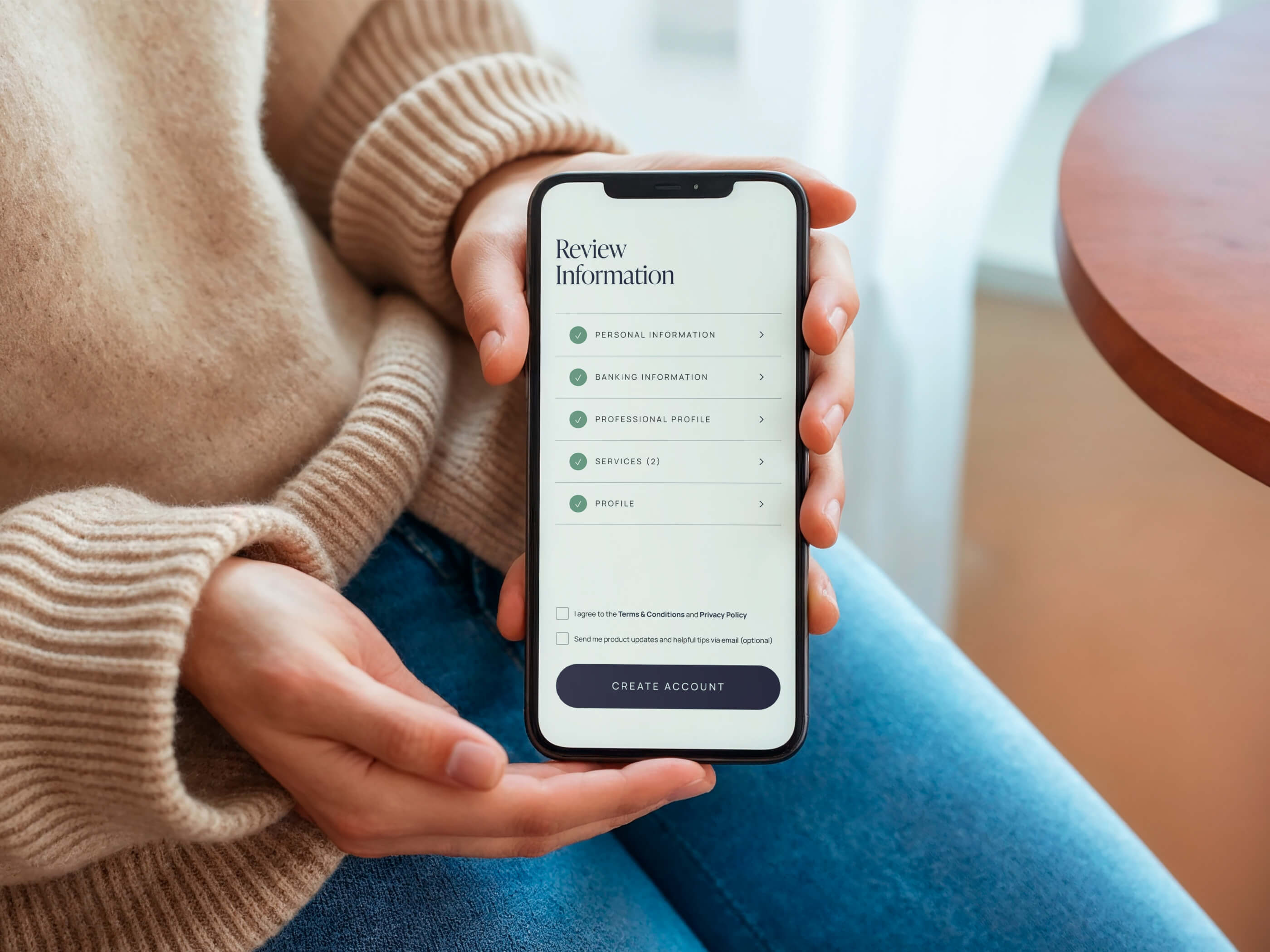
- They make onboarding feel transactional instead of supportive. Many health apps open with a series of medical-style forms asking for personal details, but without any warmth or context. When users don’t understand how this information will help them, it can feel like bureaucracy rather than care. A short message that connects each step to their goals (“This helps us tailor your insights”) can make the process feel human and purposeful.
How to design differently:
- Be transparent about privacy. Explain what each data point does for them, in plain language, at the moment you ask for it.
- Design for evolution, not episodes. Build flexible systems that grow with the user from one phase of life to another, instead of restarting the experience every time they transition.
- Make feedback immediate. Let users see value after the first few interactions; even a small insight or trend builds trust and momentum.
- Add meaning, not just metrics. Translate tracked data into insights that help people make daily decisions: when to rest, when to move, when to seek care.
3. The gender data gap is real, and it shows up in product design
Designing great health products starts with accurate data. Unfortunately, that’s where another bias creeps in.
The gender data gap, popularized by Caroline Criado Perez in Invisible Women, reveals that women and gender-diverse individuals are dramatically underrepresented in medical and product research. Much of our “standard” health data is based on male physiology.
In tech, the consequences are obvious. A landmark MIT study on facial recognition found that error rates were less than 1% for lighter-skinned men, but up to 34% for darker-skinned women. When systems are trained on biased data, those biases multiply.
In femtech, the same pattern appears. A Frontiers in Computer Science study found that most period-tracking apps assume a fixed 28-day cycle and ovulation on day 14, even though only about 10 percent of users actually follow that pattern.
But cycles aren’t fixed. They evolve. Stress, hormones, sleep, and life stages all play a role. For example, postpartum users often ovulate later, skip cycles, or experience multiple ovulations as their hormones stabilize. So while it makes sense for an app to start with a baseline assumption, it should learn and adjust as it gathers data. Treating every body as if it functions the same way leads to inaccurate insights and lost trust.
What this means for founders:
- Don’t rely on generalized “female averages.” They’re convenient for algorithms but rarely reflect how real users’ bodies behave. Health patterns vary across age, ethnicity, life stage, stress levels, and lifestyle. Designing for the average means designing for almost no one.
- Make your algorithms transparent. When your app predicts ovulation, mood patterns, or hormonal shifts, show confidence ranges or clarify that these are estimates, not certainties. Users are more likely to trust your product when you’re honest about what the data can and can’t tell them.
- Use your data to learn from users, not to simplify them. The goal isn’t to make everyone fit one model, but to let your product evolve as it learns. Build systems that adapt to behavior over time and recognize when users move into new life stages or health contexts. For example, one of our clients, for example, discovered through their own data that users who consistently engaged with their product over a six-month period were significantly more likely to achieve pregnancy than those who didn’t. That insight helped them refine how they measured progress and guided users more effectively — a clear example of how real data can reveal patterns no assumption could predict.
4. The opportunity: design with women, not for them
Here’s the good news: when you design inclusively, you stand out.
Female health is one of the fastest-growing tech categories, yet most products still fail to represent real experiences. If you design with empathy and collaboration, bringing users into your process, you’ll not only build better UX, you’ll build loyalty.
Where to start:
- Design and build with diverse voices at the table. Bring a mix of ages, backgrounds, and identities into both your team and your research. Co-create with real users instead of designing for them. People who share lived experiences with your audience will notice details others miss, from how symptoms are described to what feels comfortable to disclose.
- Focus your UX on clarity, trust, and adaptability. Clear language, accessible data visuals, and transparent explanations build confidence. The more a user understands how your app works and how their data informs it, the more likely they are to stay engaged and use it consistently.
- Treat inclusivity as infrastructure, not decoration. It’s not a feature or a color palette. It’s part of every decision you make. Not all people with female biology identify as women. Not all women are feminine. And not all “female” is pink. The more your design reflects that reality, the more authentic and human your product becomes.
The future is female health, and it’s time we design like it
If your startup is building in this space, this is your moment.
Female health isn’t something small. It’s about (and for) half the population, finally being seen as a user group worthy of thoughtful design. The founders who take that seriously won’t just build functional products; they’ll create experiences that genuinely improve people’s lives and make them feel understood, supported, and seen.
.jpg)