Link copied to clipboard
A few months ago, our doctor recommended a baby meal app.
It promised to teach me what I could cook for my son as he started solids, what foods to introduce, what to avoid, and how to make nutritious meals.
So I downloaded it, excited to get some guidance.
And I did get ideas… but every meal looked like something out of a fancy restaurant menu.
Tiny towers of quinoa.
Purees with ten ingredients.
Snacks that would take me forty-five minutes to prepare and five seconds for my son to throw on the floor.
The app wasn’t bad, it was beautiful actually, but it wasn’t built for real life.
This happens a lot in family-tech products.
The goal is meaningful, helping parents, supporting families, improving health, but somewhere along the way, the design forgets who it’s for.
We often think of parents as one single type of person, but they’re not.
Some are new parents juggling nap schedules and feeding charts. Others are experienced parents managing multiple kids, or single parents trying to balance everything alone. Their days, priorities, and mental bandwidth look completely different.
If your product is built for a specific stage, be clear about it.
And if it’s meant for all, make sure it accommodates those variations in energy, attention, and need.
Parents are navigating a lot: fatigue, multitasking, emotional load. They don’t need more inspiration.
They need relief.
After working with different family-tech brands and as a parent myself, I saw how often this gap shows up in design. That’s what inspired me to create what I now call REAL Life Design, a framework that helps founders build products that work with users’ lives, not against them.
After working with different family-tech brands and as a parent myself, I saw how often this gap shows up in design. That’s what inspired me to create what I now call REAL Life Design, a framework that helps founders build products that work with users’ lives, not against them.
REAL stands for Relatable, Easy, Adaptive, and Light.
It’s a practical way to design products that fit naturally into family life, and it’s simple enough to start applying right now.
Speak human. Design for connection, not performance.
Parents connect with products that feel like they were built by someone who understands what life actually looks like.
Try this:
Example: Instead of “Track your baby’s milestones consistently,” try “A few photos a week are plenty, these moments go by fast.”
If you have user feedback or reviews but don’t know how to make sense of it all, tools like ChatGPT can help you analyze it quickly and spot patterns. It’s not about outsourcing empathy, it’s about scaling it.
Here’s a prompt you can use to uncover how your audience actually talks about their needs:
I’m designing a family-tech app for [briefly describe your audience, e.g. new parents introducing solids]. I’ve collected real comments, reviews, or survey answers from users. Analyze the text below and tell me:
This kind of analysis helps you mirror the way your users naturally speak and feel, so your product sounds like it was designed with them, not for them.
Lower the bar. Small wins build big trust.
When life is busy, users stick with the product that helps them succeed fastest. “Easy” doesn’t mean basic. It means clear, achievable, and rewarding from the very first tap.
Try this:
Example: A baby meal app could start with “What ingredients do you have?” and offer one simple recipe, not twenty fancy ones.
Mini exercise: The One-Minute MVP
This is a quick design-thinking exercise to help you experience what “easy” really feels like.
You’ll be surprised how often simplicity leads to more clarity, not less value.

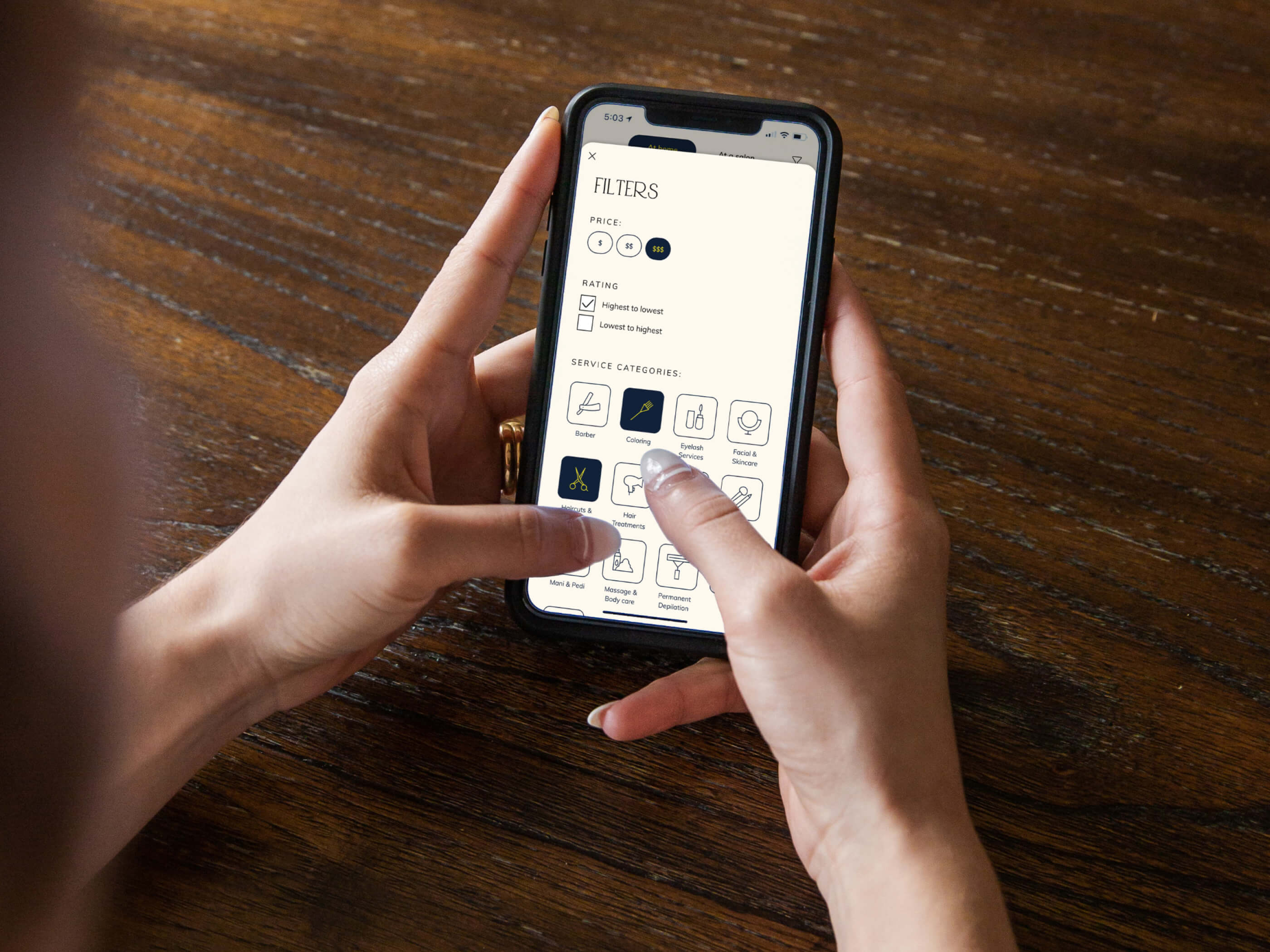
For example, a few years ago, we designed the MVP for Avina, a beauty and wellness directory created for parents, especially single parents.
Their biggest challenges were convenience and searchability. They needed flexibility to book services that fit unpredictable schedules, and an easy way to find nearby options without endless scrolling.
We made the experience highly visual to reduce cognitive load, built a clear content hierarchy so users could quickly spot places offering multiple services in one visit, and designed flows that felt as simple and familiar as ordering an Uber, only this time for a beauty appointment.
Design for both calm mornings and chaos evenings.
Family life changes by the hour. Some days parents have time to explore your app, and other days they’re just trying to get one thing done between naps and meetings. Apps that expect users to be consistent lose them, but apps that flex with their reality build loyalty.
Try this:
Example: Replace “You missed three days” with “Welcome back, ready to pick up where you left off?”
Mini exercise: The Two-Mode User Test
This quick test helps you see if your product works for both the calm and the chaotic moments.
You’ll start spotting where your experience feels heavy or unforgiving, and that’s where adaptability needs to step in. This exercise will not map out exactly how users behave in real life, but it will give you a sense of what happens when attention is split, which, for parents, is most of the time.
Design for emotional clarity. Less pressure, more peace.
Parents already manage constant noise, information, and decision fatigue. Your app should feel like a calm space, not another source of pressure. A “light” experience is visually clear, emotionally reassuring, and easy to navigate, even after a long day.
Try this:
Example: Instead of daily reminders, send one gentle message: “Here’s one new food your baby can try this week.”
Mini exercise: The Calm Screen Audit
Optional tool: Use AI for a visual audit
You can use AI design-review tools like Uizard Autodesigner or Galileo AI to get an instant assessment of visual hierarchy, colour balance, and clutter. Upload your screen and ask:
Evaluate this screen for clarity, focus, and emotional tone. What elements might overwhelm a parent or distract from the main goal? Suggest three design adjustments that would make it feel calmer and more approachable.
AI will not replace your intuition, but it can highlight issues you might overlook when you are too close to your own design.
When products are Relatable, users feel seen.
When they’re Easy, users feel capable.
When they’re Adaptive, users feel safe to return.
When they’re Light, users feel at peace.
Those emotions are what build trust, retention, and love for your product, not the number of features you ship.
When someone opens your app, they’re not just evaluating usability.
They’re deciding if it deserves a spot in their already-full day.
The baby meal app I mentioned at the beginning wasn’t wrong. It just wasn’t realistic.
It was built for parents with time to meal prep and photograph their food.
But the reality? Most of us are cooking with one hand and chatting with ChatGPT with the other.
And that’s the heart of REAL Life Design: creating products that work in that world.
Because real life doesn’t need perfect UX. It needs believable UX.
The kind that makes people feel supported, not scolded.
Encouraged, not overwhelmed.
And above all, seen.
In the end, I stopped using the app altogether.
Instead, I started getting creative, brainstorming easy meals with what I had, asking other moms for ideas, and yes, using ChatGPT for quick inspiration based on the ingredients in my fridge.
Turns out, a little creativity and empathy go a long way, in the kitchen and in design.
.jpg)
.jpg)