Link copied to clipboard
.jpg)
When you design for healthcare, every interaction matters, especially the first one.
For this project, I’ve been exploring the onboarding flow of a pediatric telehealth app where parents or guardians create an account and provide their child’s medical information.
On paper, it sounds simple: fill out a few forms, add a few details.
In practice, it’s anything but.
To book a virtual appointment, parents need to share quite a bit of information: everything from their child’s allergies and medications to insurance details and caregiver contacts.
It’s all essential before a doctor can see the child, but the reality is that no parent sits down calmly at 8 PM with a cup of tea and fills out 12 screens of forms.
They’re juggling bedtime routines, snacks, and notifications. Some might get through it in one sitting. Most won’t.
That’s where the real UX challenge begins:
How do you make something mandatory feel manageable?
How do you design for people who are distracted, tired, and interrupted, but still need to complete the process?
The first step was to break the onboarding into three main sections:
Each section expands into smaller subsections, and sometimes those subsections contain even more details. It’s a lot to take in, so structure and visual hierarchy became the anchors of this experience.
I used a side navigation that always shows where you are and what’s left. It’s not strictly linear; users can jump around between sections as long as dependencies are met.
Inside each section, steppers and progress bars create a clear sense of advancement. Even if you only complete one part, it still feels like progress, like checking off an item on a to-do list rather than being buried under paperwork.
One of the first realities we had to accept:
Parents might not finish in one sitting, and that’s okay.
To support that, autosave became a non-negotiable.
It’s the quiet UX hero in any complex form, preventing frustration and loss of trust.
If a parent has to step away mid-way through entering allergy details, they should be able to pick up right where they left off the next morning. No lost data. No repeated effort.
.jpg)
In this flow, empty states carry a lot of weight.
They guide users to fill out critical sections (“Add your child’s allergies or reactions to medications, foods, or other triggers”) while keeping the tone supportive, not clinical.
Each empty state visually communicates why the information matters, inviting action without adding pressure. Once completed, the space transitions into a clean, summarized view that reassures the user their effort was worthwhile.
.jpg)
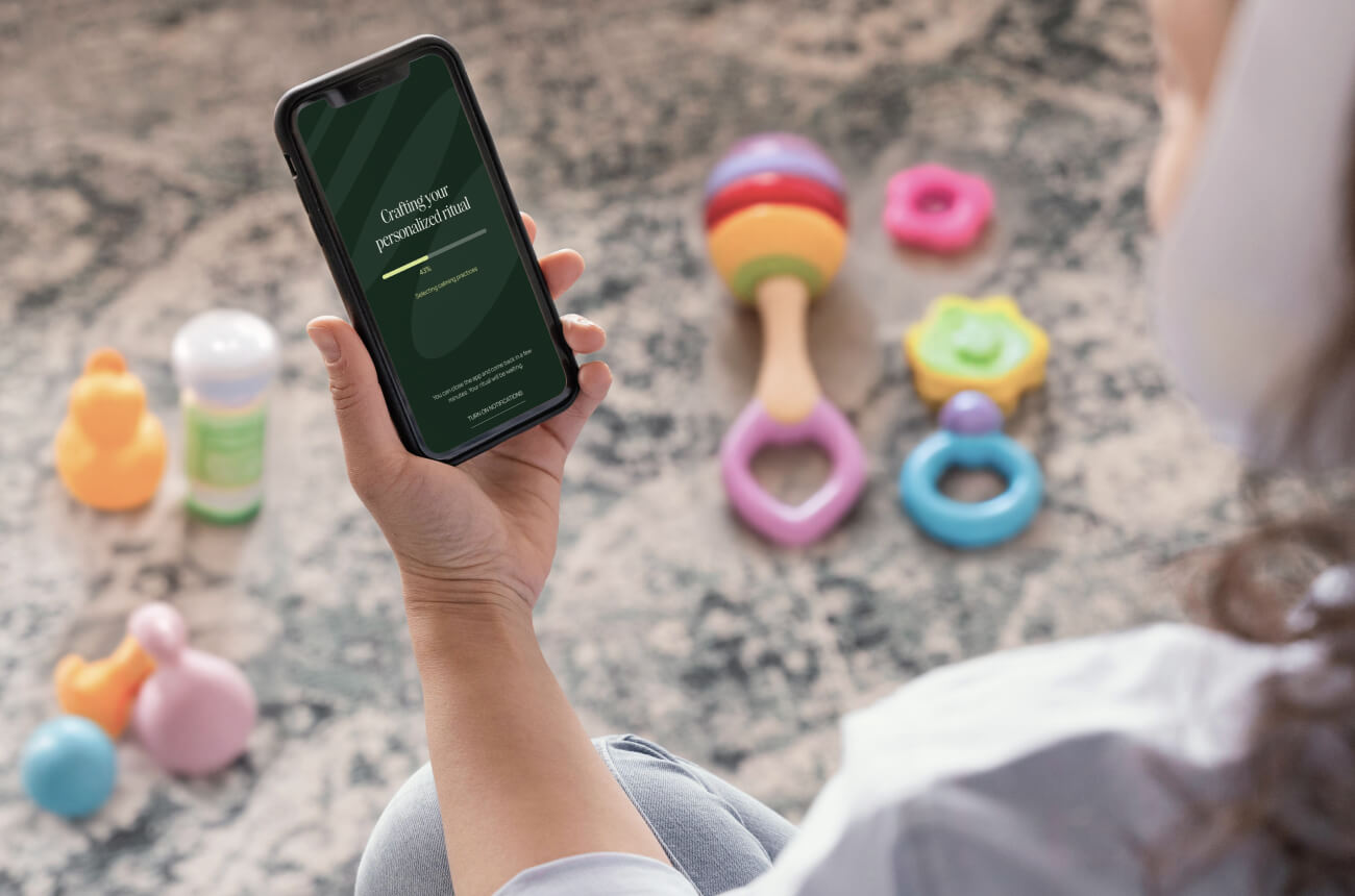
I’ve also been exploring how voice or AI-assisted input could simplify these moments. For instance, allowing parents to record a quick note like, “Peanut allergy with mild skin reaction,” which then auto-fills the relevant fields.
That’s not part of the MVP, but it’s an exciting direction for the next iteration.
For now, the focus is on clarity, flow, and reducing friction, not novelty for novelty’s sake.
.jpg)
At its core, this onboarding experience isn’t about pretty interfaces.
It’s about reducing cognitive load for people already carrying a mental one.
By breaking large tasks into digestible steps, autosaving progress, and using thoughtful empty states, the goal is to help parents feel supported, not scolded, as they move through the process.
Over the next few weeks, I’ll be testing these concepts with both AI simulations and real users to refine how the flow feels in action.
Stay tuned!