Link copied to clipboard
Some projects remind you why good design is more than aesthetics.
Our recent collaboration with Compass Digital Ventures (CDV) was one of them.
CDV is the innovation arm and venture capital branch of Compass Group, one of the world’s largest food and hospitality companies. Their mission is to partner with, invest in, and pilot startups that are redefining the way we eat, work, and care for people across education, healthcare, and workplace environments.
They act as a bridge between global-scale infrastructure and the fast-moving innovation that startups bring.
Our challenge was to make their brand and website reflect that bridge.
When CDV first came to us, their brand had the basics: a logo and a few colors. But it lacked a visual system that could tell their story. Without consistency or depth, their brand and website felt too plain to reflect the caliber of innovation they were driving.
This disconnect created a real problem. Their online presence wasn’t clearly communicating what they did or the scale of their impact. Many startups didn’t immediately understand who they were or how powerful it could be to partner with them. Some were hesitant to collaborate until they realized CDV was part of Compass Group.
Inside the organization, their team often found themselves over-explaining what Compass Digital Ventures stood for instead of letting their digital presence do the talking.
And beyond that, creating new assets was tedious. Because there were no clear brand guidelines, every new presentation, deck, or campaign felt like reinventing the wheel.
They needed a brand system that would not only look cohesive but make execution easier, a foundation their team could actually build on.
We began by defining what CDV represents to both of their key audiences.
To leadership teams within Compass Group, they represent innovation with purpose.
To startups, they represent access, partnership, and opportunity.
We needed a visual identity and digital experience that spoke fluently to both sides. The result had to balance corporate credibility with startup energy while feeling cohesive and trustworthy.
Our creative direction followed three principles:
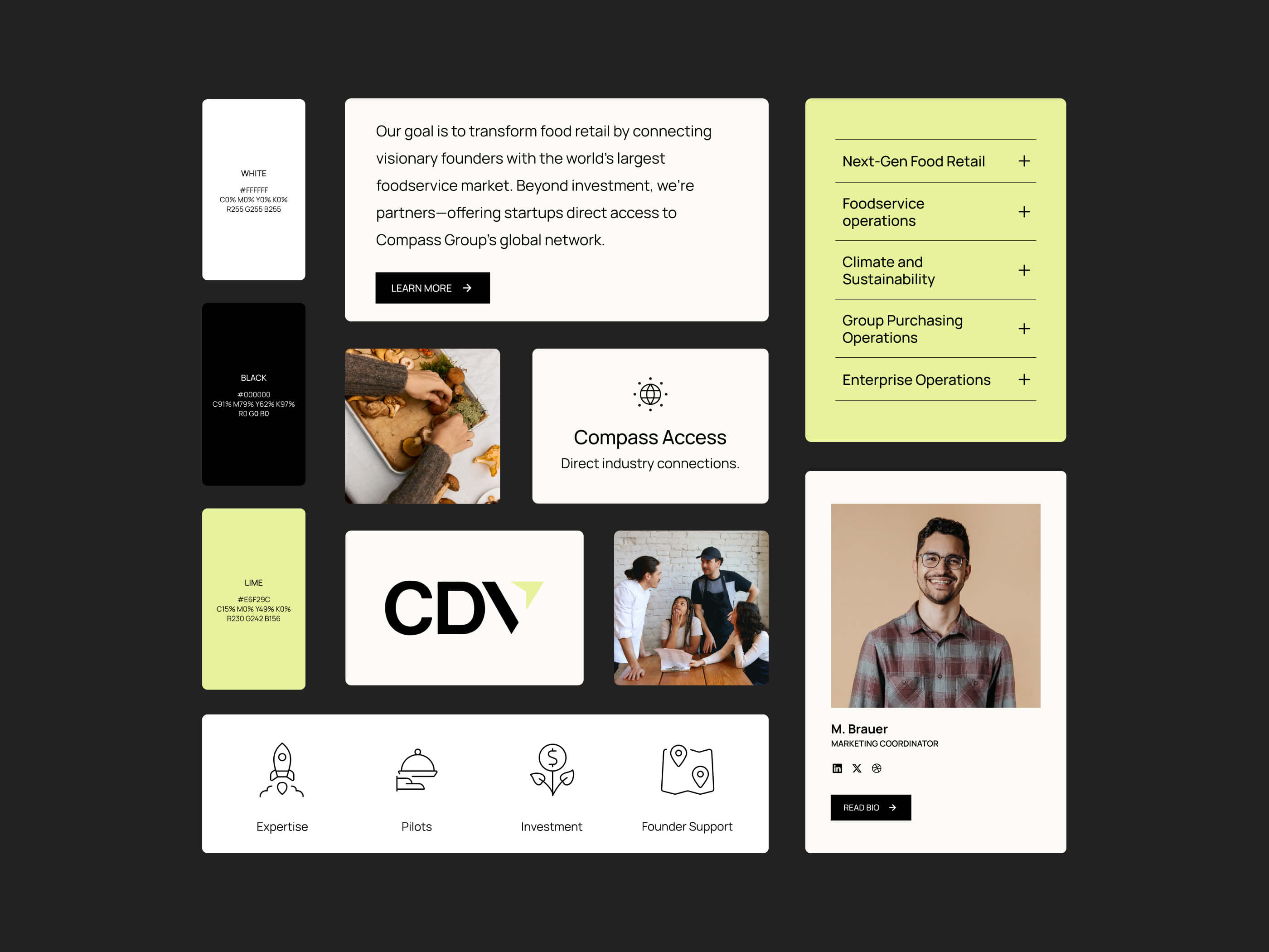
The final design strikes a balance between minimalism and warmth. We developed a clean, flexible color palette built around black, white, and a lime accent. The lime — a bright yellow-green tone — became the visual pulse of the brand, adding freshness and energy without feeling overly techy.
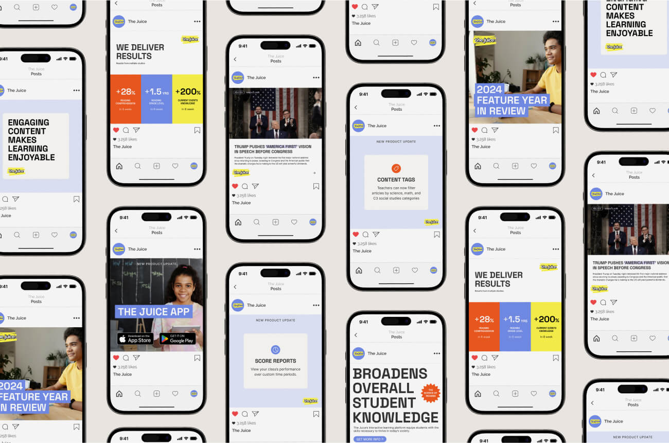
Typography was chosen for clarity and structure, reinforcing a sense of confidence and credibility. While the copy was written by CDV’s copywriter, our layouts were designed to make it easy to scan. We focused on spacing, hierarchy, and short, readable sections because most visitors want to understand what you do in seconds.
Photography played a central role in this project. We worked with CDV to select images that reflected the real people and stories behind the brand. The visuals showcase collaboration, experimentation, and human connection — the things that make innovation feel real.
Rather than polished stock photos, we used imagery that showed energy and movement: teams brainstorming, testing ideas, and visiting partner startups. Each image supports the story of how Compass Digital Ventures operates within the larger Compass ecosystem, turning ideas into scalable impact.
The new website was built with two key audiences in mind: startups and corporate stakeholders.
Startups can now quickly understand what CDV does, how they invest, and what partnership opportunities exist. Meanwhile, Compass Group leaders can see proof of innovation within their organization.
We focused on:
The result is a cohesive, modern, and human-centered website that finally communicates the credibility and energy behind the CDV team.
This project reinforced something we believe deeply at Random Pattern Studio: design should build trust.
Compass Digital Ventures needed a brand and website that truly reflected their power, their people, and their potential. By connecting structure with creativity, and legacy with innovation, we created a brand system that does more than look good — it simplifies workflows and tells their story clearly and confidently.
While our studio primarily partners with family tech and femtech founders, the principles are universal. Whether you are building a wellness app, a fertility platform, or an innovation fund, your brand and website should reflect the full depth of what you are creating.
Because when your online presence communicates your story with clarity and confidence, it becomes your strongest ally in growth.
------
If your startup is scaling and your brand no longer reflects your potential, it might be time for a refresh.
A strategic brand and website redesign will help you connect the dots between your vision and how the world sees you.