Link copied to clipboard

Your healthcare app has a 68% drop-off rate at step three. Your family scheduling platform loses users mid-signup. Your fintech product for moms has terrible conversion rates.
The problem might not be what you think. It's not your content, your brand, or your value proposition. It could be as simple as choosing the wrong navigation pattern for your user's context.
Both steppers and progress bars are valuable UX patterns. The key is knowing when each one serves your users best.
Progress bars show percentage completion with a visual indicator (usually a filled bar from 0-100%). They're linear, move in one direction, and emphasize momentum toward completion.
Best for: File uploads, processing tasks, single-session activities with known duration
User message: "Keep going, you're making progress"
Steppers show discrete stages with clear labels. Users can see all steps upfront, navigate between them, and understand exactly what's required at each stage.
Best for: Multi-section forms, complex onboarding, processes requiring review, save-and-return flows
User message: "Here's the full journey, here's where you are, you have control"
People using family tech, health apps, and lifestyle platforms aren't scrolling mindlessly. They're making decisions about their health, their children, their finances. High-stakes choices that require trust.
And they're often doing it while interrupted.
A mom filling out a pediatric telehealth form gets interrupted by a toddler spilling juice. A woman researching healthcare options tabs away to check a text. A parent setting up a college savings plan needs to ask their partner a question.
When they return (maybe hours or days later) they need the right navigation pattern to help them continue confidently.
Progress bars excel when users need encouragement to keep going through a linear process they've already committed to.
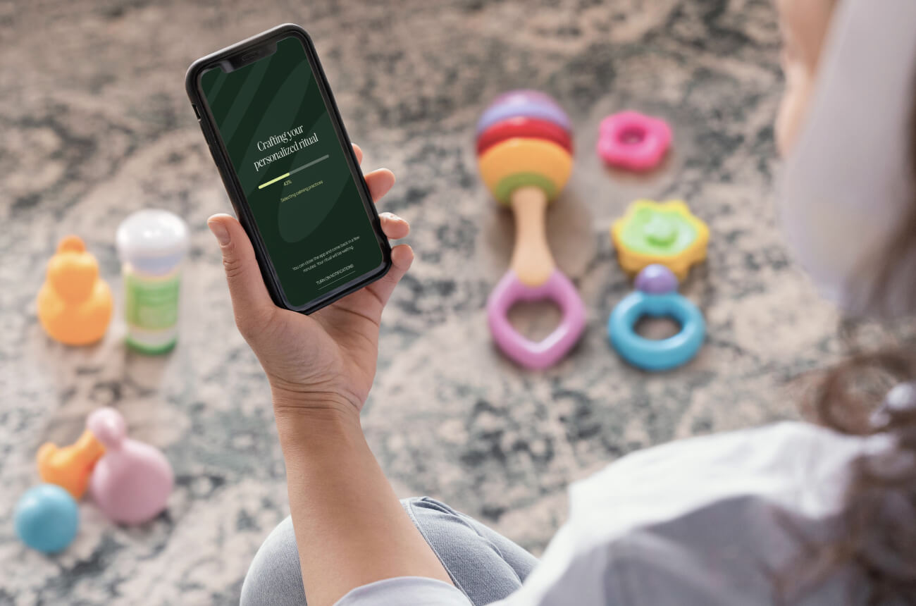
File uploads and processing: When a user uploads medical records or downloads a health report, a progress bar shows them the system is working. It reduces anxiety during a wait period and provides clear feedback.
Timed activities: During assessments, quizzes, or guided workflows where users complete everything in one sitting, progress bars provide motivation without overwhelming them with details.
Simple, short forms: For straightforward signup flows that take under 3 minutes and don't require review, progress bars keep users moving forward without adding visual complexity.
When momentum matters more than orientation: If your users are unlikely to be interrupted and your goal is to maintain forward momentum, progress bars create a sense of accomplishment with each step.
Steppers shine when users need transparency, control, and the ability to orient themselves in a complex process.
Multi-stage onboarding with interruptions: When users need to enter information across multiple categories (personal details, dependents, medical history, insurance) and are likely to be interrupted or need multiple sessions to complete. Steppers let them see where they are and pick up exactly where they left off.
Sensitive data collection: When you're asking for financial information, health records, or personal family data, steppers build trust by showing the full scope upfront. Users can see exactly what you're asking for before they commit, which reduces anxiety about "what comes next."
Multi-user or household workflows: When families or partners need to collaborate on filling out forms together, steppers help coordinate who handles which section. Clear labels show "Your Info → Partner Info → Children" so everyone knows their role.
Processes requiring review and revision: When users need to verify information before submission (insurance applications, medical forms, legal documents), steppers make it easy to jump back and make corrections without losing progress or starting over.
Save-and-return workflows: For any process that might take multiple sessions to complete, steppers provide clear orientation points. Users returning days later can immediately see "I finished the first three sections, now I need to complete Insurance."
Choose progress bars when:
Choose steppers when:
Your family tech users aren't just filling out forms. They're deciding whether to trust you with their most important information, their children's data, their health records, their financial details.
The right navigation pattern isn't about following trends. It's about respecting your users' reality: their interruptions, their need for control, their desire for transparency.
Both patterns are powerful tools. Choose the one that serves your specific user's context, and you'll see completion rates rise.
.jpg)