Link copied to clipboard

One of the projects that has stayed with me over the years is Punto Pediatrico, a pediatric practice I helped brand a few years ago.
It wasn’t a tech startup like most of the clients I work with today, but it was part of the same world: caring for families, creating trust, and designing experiences that feel good from the very first interaction.
I wasn’t a parent yet, but everything about this project felt natural. The story made sense. The tone came easily. The design flowed. I clearly understood what they needed, and it all just clicked.
From the start, we knew this brand couldn’t look like a typical medical practice.
So many clinics leaned on sterile blues and cold visuals. We wanted something brighter, friendlier, and far more human, a space that parents would trust and kids would actually want to visit.
That balance guided everything: warm enough for parents to feel confident, playful enough for children to feel comfortable.
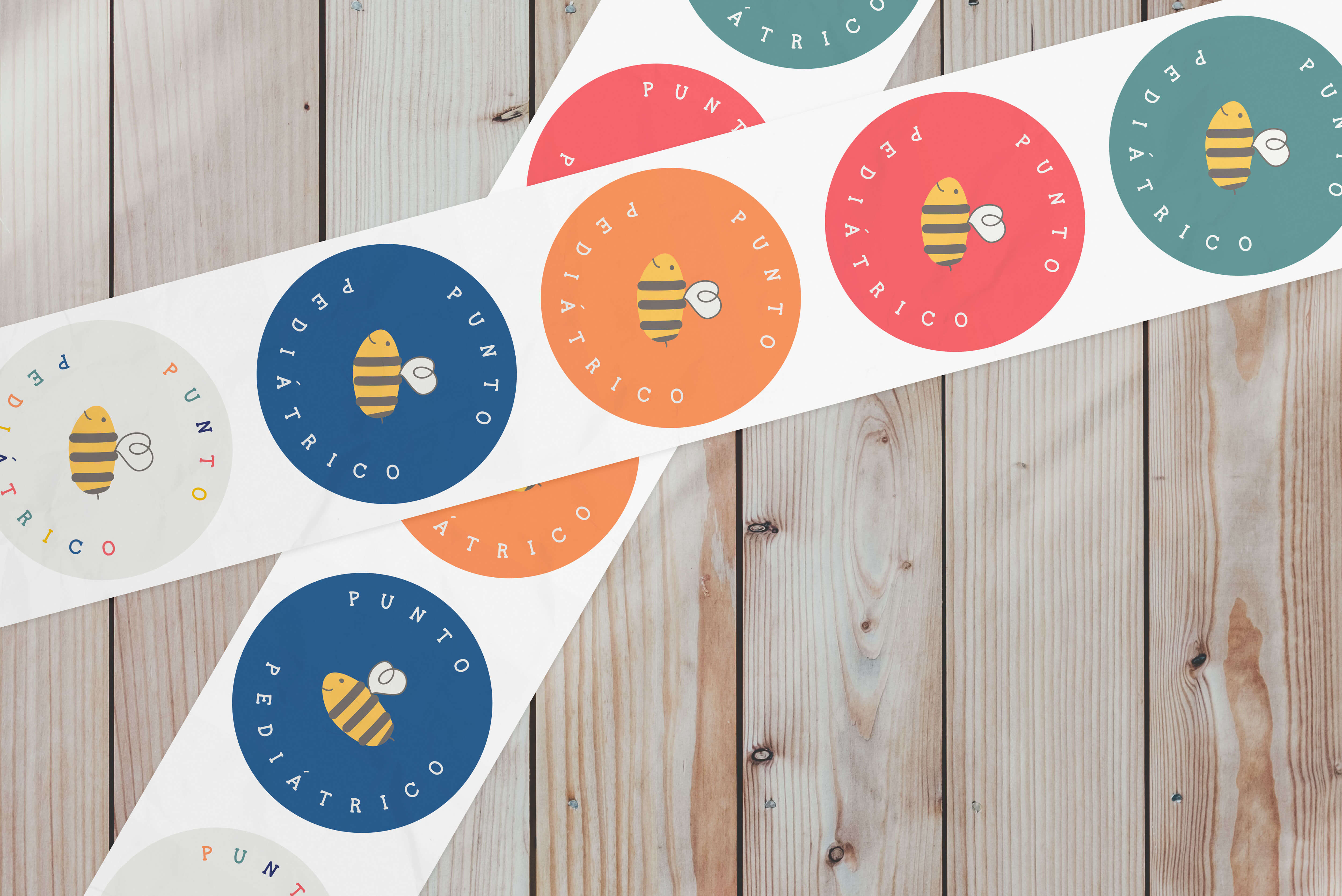
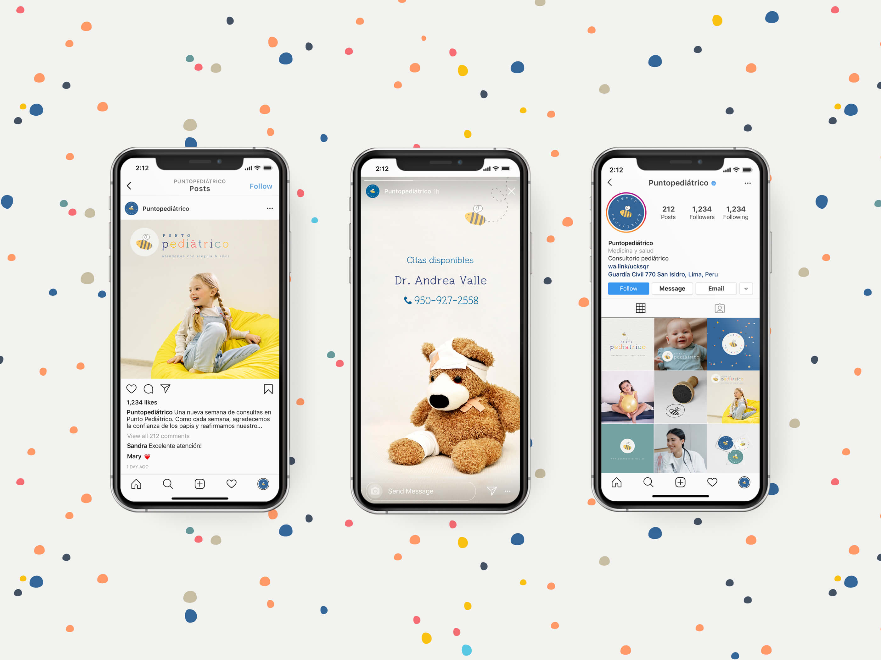
That’s how the bee became the heart of the brand.
We considered other ideas like clouds, balloons, and sunshine, but the bee carried more meaning. It wasn’t just cute; it was symbolic.
Bees represent teamwork, care, and community. Every bee contributes to something larger, just like every doctor, nurse, and parent contributes to a child’s wellbeing.
And beyond that, bees are essential to our planet’s ecosystem. They keep things growing, thriving, and connected, a perfect metaphor for a practice devoted to nurturing health.
We built the brand around that idea. The bee appeared in the logo, in illustrations, and across the clinic’s materials, creating a consistent, cheerful presence. The colour palette was bright yet calm, fun without being chaotic. Every detail was designed to make families feel safe and welcome.
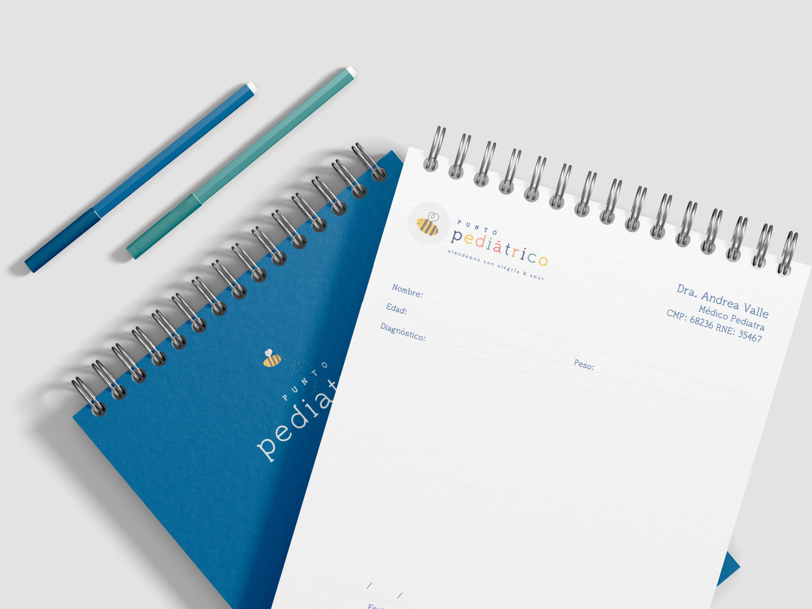
The visual identity needed to feel playful and approachable without losing its sense of professionalism.
We chose a colour palette that was vibrant but clearly defined, helping the brand stand out while still feeling cohesive across all touchpoints. Alongside that, we selected two typefaces that balanced a handwritten look with strong readability.
Since the brand would live both in the clinic’s décor and across everyday materials like forms and letters, the typography had to work in every context. The handwritten style added warmth and personality, while the secondary font grounded the system and kept it practical.
The bee itself, like the rest of the visual elements, was designed to feel almost handmade yet still clean. That combination of playfulness and polish was what built trust with parents while keeping the experience inviting for children.
This project happened 4 or 5 years ago, but it still stands out as one of those that remind you why you design.
When parents bring their children to a clinic, they are handing over their most precious thing. The brand has to reassure them instantly that they are in good hands.
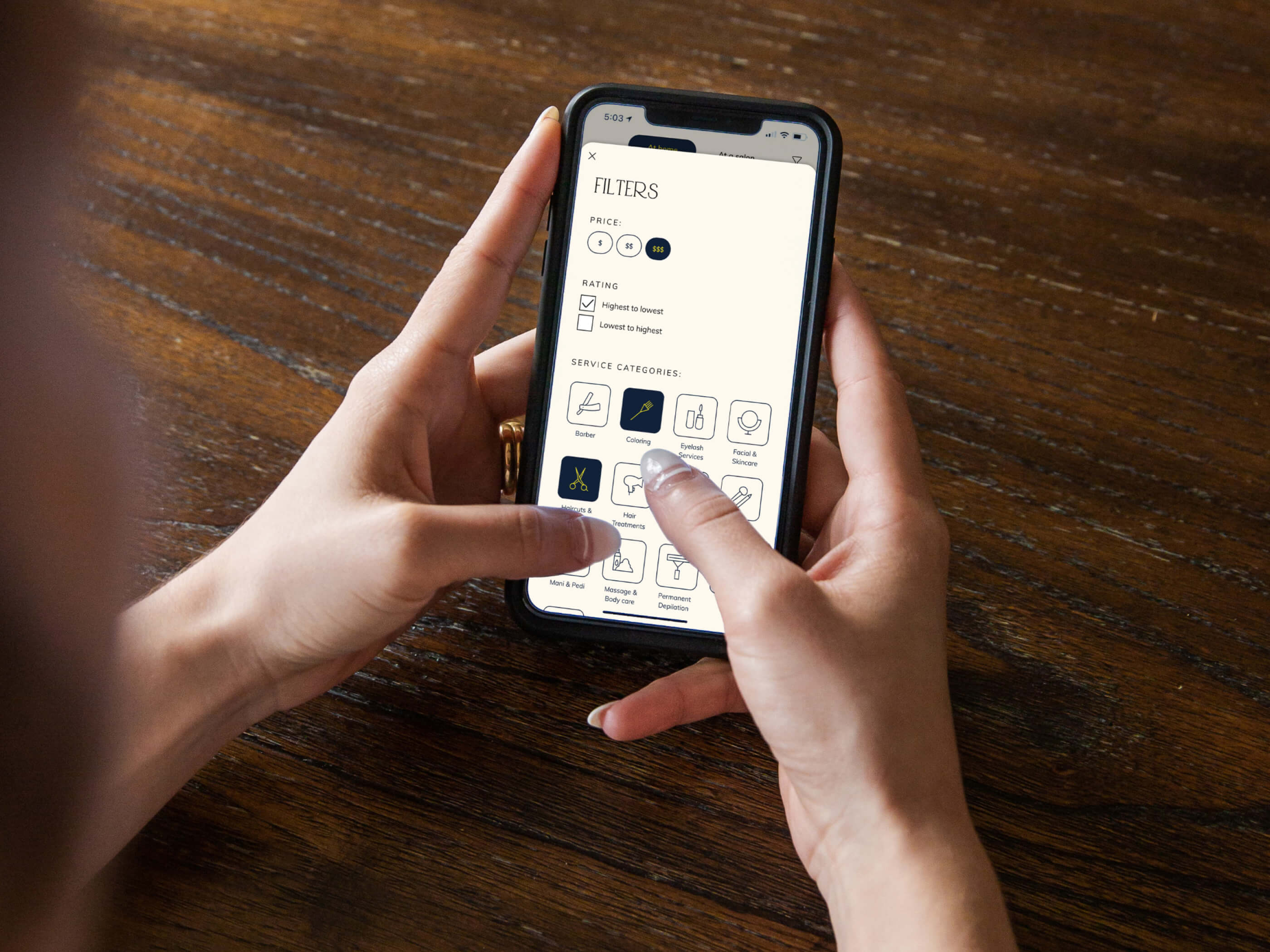
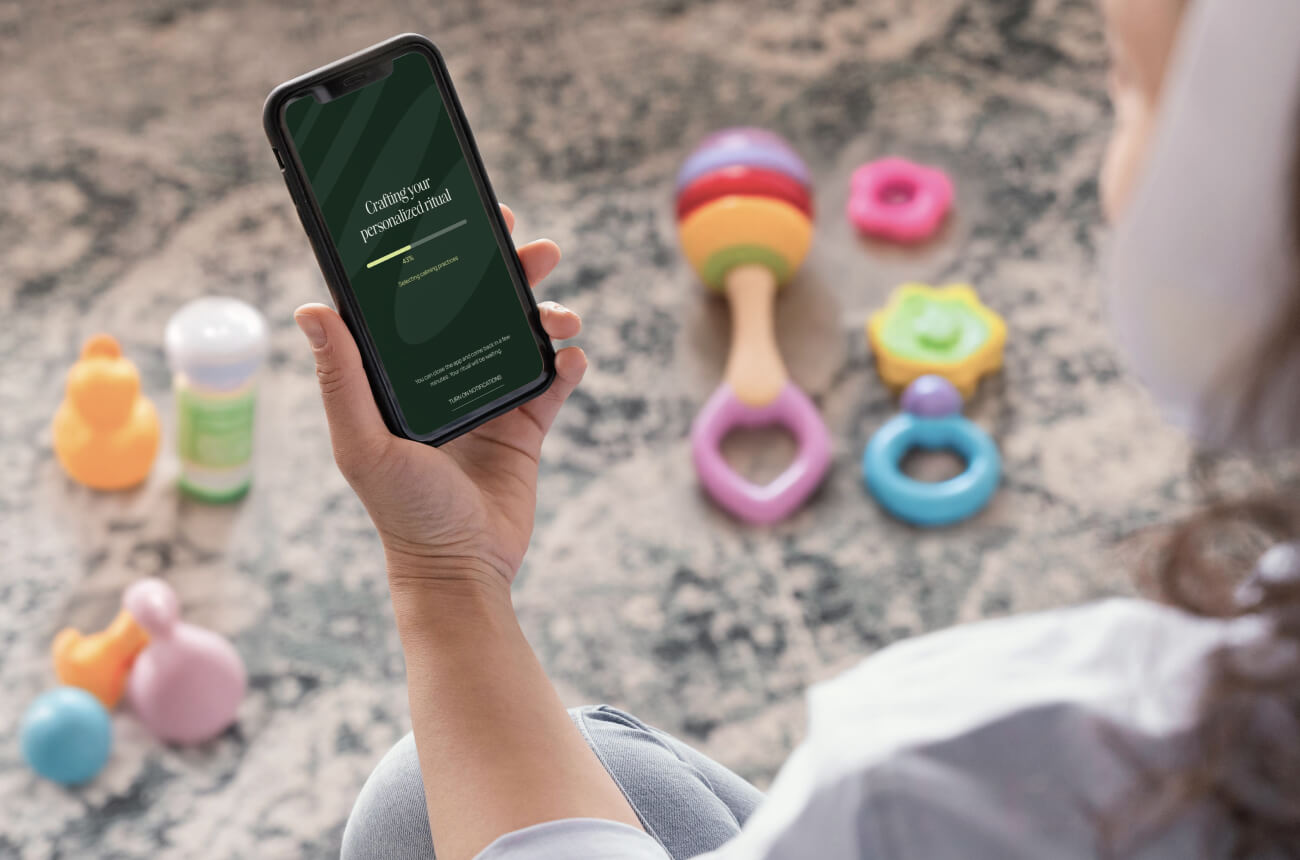
That same principle now guides my work with family and femtech startups. Whether it is a pediatric telehealth platform or a wellness app, the goal remains the same: to make people feel supported, understood, and at ease.
I still think of that bee often.
It reminds me that good design is never about a single element; it is about how everything works together toward a shared purpose, just like bees in a hive.
Punto Pediátrico may not have been a tech startup, but it shaped how I see design today: as something deeply human, collaborative, and full of quiet meaning.