Link copied to clipboard
Most fertility and pregnancy apps look thoughtful on the surface. The UI is polished, the flows feel familiar, and the experience makes sense if your journey is smooth, linear, and fits a traditional family structure. But most fertility journeys don’t look like that. They move through loss, treatment, complex family dynamics, cultural expectations, and health realities that rarely get reflected in the product. These aren’t rare scenarios. They’re everyday experiences that shape how people try to conceive. When an app assumes one type of user and one type of journey, it does more than create friction. It can cause real harm. This post explores the inclusivity gaps fertility and pregnancy apps consistently overlook and why designing for real, diverse user journeys has to start on day one.
Most fertility and pregnancy apps are built around one assumption: things will go well. The interface celebrates every milestone, counts up each week, shows upbeat fetal development visuals, and sends cheerful notifications. But fertility journeys are rarely that predictable. And when something goes wrong, the experience can shift from supportive to painful in seconds.
During loss, users often have to:
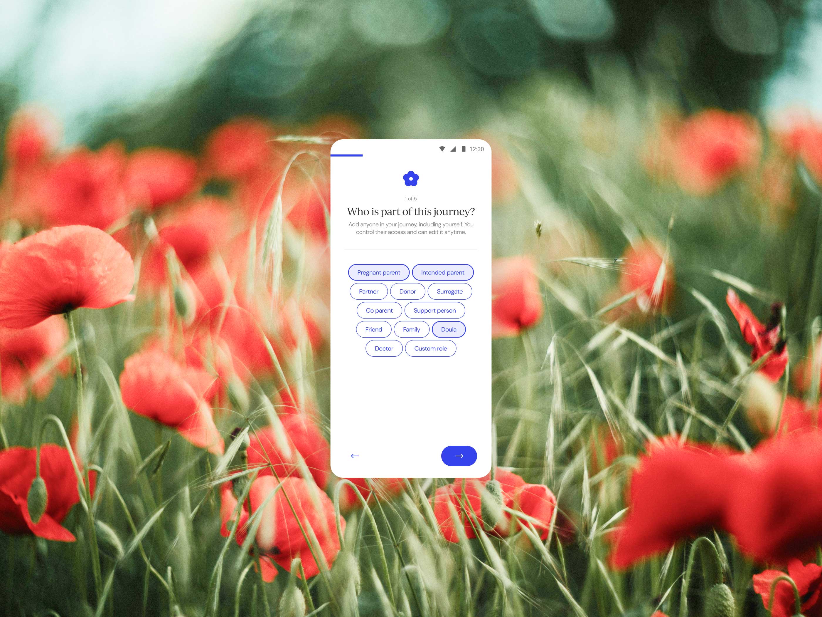
Most fertility and pregnancy apps still default to a single narrative: a heterosexual couple conceiving through intercourse. The language, flow, and feature set all follow that path. But fertility journeys take many shapes, and when your app only recognises one, you unintentionally push everyone else to the margins.
Rigid assumptions make the app feel unwelcoming. Users are forced to fit into templates that don’t match their lives:
Most fertility and pregnancy apps quietly assume that users have the time, energy, health, and cognitive capacity to move through their journey in a typical way. But many people are navigating fertility while also managing chronic illness, neurodivergence, mental health needs, mobility differences, or unpredictable energy levels. Their experiences aren’t “special cases.” They’re part of the everyday landscape of fertility.
When apps assume one type of body and one type of brain, they push these users into the background. They end up with:
Fertility journeys often come with real financial strain, even outside of clinical treatment. People are already paying for tests, supplements, childcare, transportation, time off work, or ongoing wellness routines. When fertility apps put core functionality behind subscription gates, they often don’t realise they’re designing for users with comfortable financial margins. The issue isn’t monetization. It’s tying the basics of fertility support to someone’s income level.
When essential features require payment, users who need structure the most end up with the least. This commonly includes:
None of these are luxury add-ons. They’re the basic tools people rely on to stay organised and informed during an already stressful chapter.
Most fertility and pregnancy apps are designed with Western, secular norms in mind. That means the language, milestones, food guidelines, and privacy defaults reflect only a small portion of global fertility experiences. For many users, these assumptions aren’t just inaccurate. They create friction or discomfort during a deeply personal journey.
Real inclusivity means designing for the emotional, cultural, financial, and health realities that shape fertility journeys every day. These paths are rarely linear. They move through loss, complex family structures, cultural expectations, financial strain, and life circumstances that do not fit the traditional script most apps rely on. When a product only works for smooth, predictable journeys, it unintentionally harms the people who need thoughtful design the most. The answer is simple. Design for loss, diversity, cultural context, and real life from the beginning. Not as extras. As the foundation.
.jpg)
.jpg)
.jpg)
