Link copied to clipboard
If you look at most femtech products on the market, they’re impressive.
Cycle tracking.
Symptom logging.
Hormone insights.
Nutrition recommendations.
Workout plans.
Mental health check-ins.
Community spaces.
Reminders for everything.
On paper, it feels comprehensive. Serious. Competitive.
As a femtech designer, I understand where this comes from. Founders are often building in a space that still fights for legitimacy. There is pressure to prove value. To show investors the product is robust. To demonstrate that you are not “just another period app,” but a full female wellness platform.
So the roadmap expands.
More tracking.
More personalization.
More dashboards.
More data.
And technically, none of that is wrong.
But here’s what I see over and over again when working with female wellness brands and femtech startups:
The product becomes heavier as the user becomes more fragile.
The more features we add in the name of value, the more cognitive weight we place on someone whose energy, mood, focus, and capacity are not stable to begin with.
That tension rarely shows up in product planning documents.
When we design SaaS tools, productivity apps, or even many wellness platforms, we assume a baseline level of consistency. Daily engagement. Habit discipline. A relatively stable emotional state. Predictable cognitive capacity.
But people living in hormonally dynamic bodies do not operate on a flat line.
Energy shifts.
Emotional sensitivity shifts.
Motivation shifts.
Pain levels shift.
Focus shifts.
Yet many femtech products are designed as if the user interacting on a high-energy Tuesday is the same person logging in during a low-energy, emotionally raw premenstrual day.
They are not.
And when we ignore that reality, we unintentionally design products that demand steadiness from users whose bodies are built around fluctuation.
As a femtech designer, this is where I believe the real work begins.
The question is not how many features we can build.
It is whether the product understands the hormonal reality of the person using it.
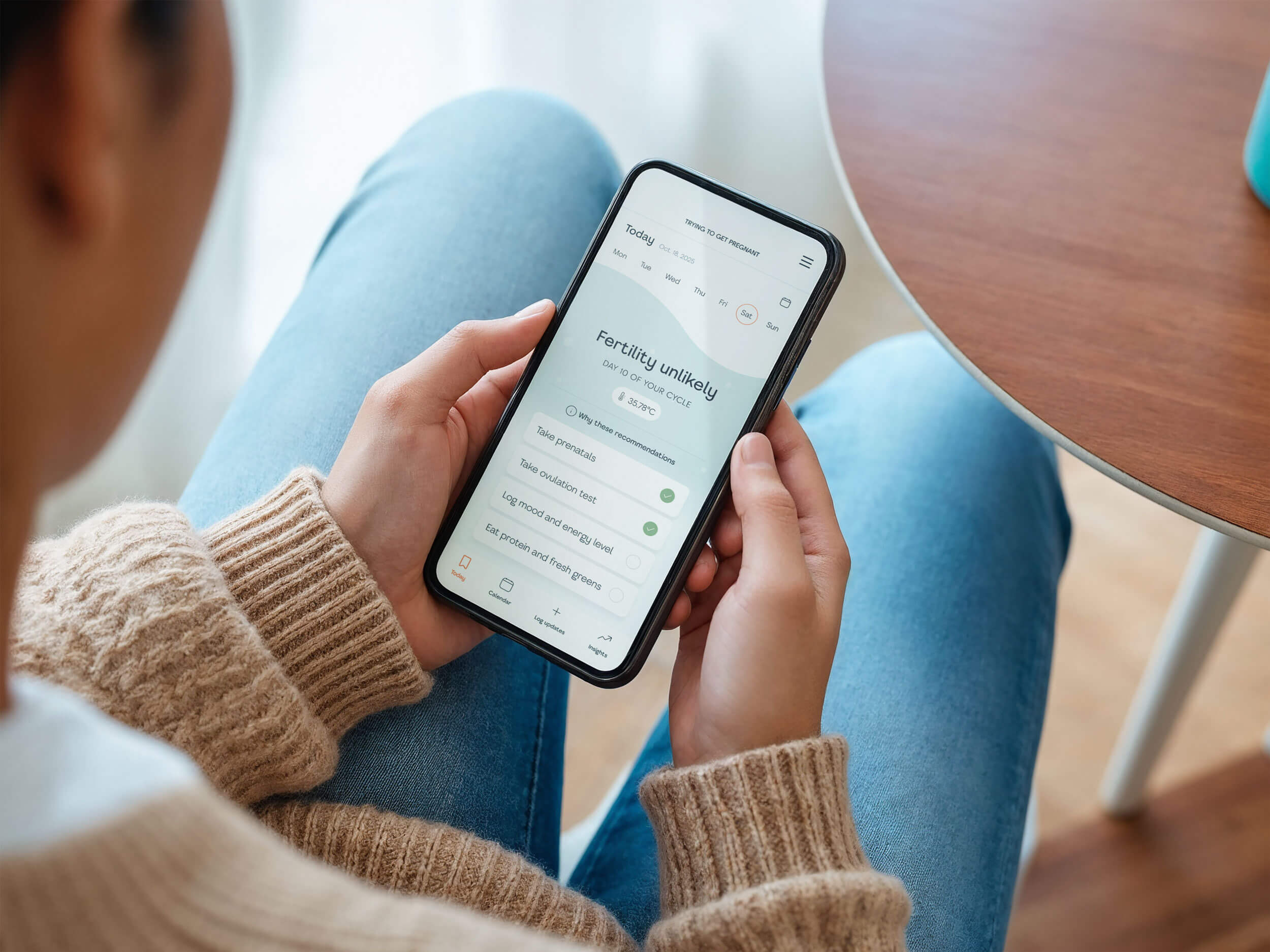
When we talk about hormones in femtech, we often talk about data.
Estrogen rising.
Progesterone dropping.
Phases shifting.
Trends over time.
But hormonal reality is not just data. It’s lived experience.
And lived experience is not linear.
As a femtech designer working with female wellness brands, I think this is where many products unintentionally miss the mark. We design for patterns. But users live through fluctuations.
One week, someone might feel clear-headed, motivated, socially open. Tracking feels easy. Planning feels satisfying. Insights feel empowering.
The next week, that same person might feel foggy, overstimulated, emotionally sensitive, or physically uncomfortable. Logging symptoms feels like work. Notifications feel intrusive. A dashboard full of metrics feels overwhelming.
It’s the same user.
But it’s not the same capacity.
Most digital products assume consistency. They are built around the idea that if a feature is useful on Monday, it will be equally usable on Friday. If a reminder is helpful once, it should be automated daily. If tracking improves outcomes, more tracking must be better.
That logic works in stable systems.
But female physiology is not built around stability. It is built around rhythm.
And rhythm includes contraction as much as expansion.
Designing for hormonal reality means acknowledging that cognitive and emotional bandwidth fluctuates. It means recognizing that decision fatigue can spike at certain times. That self-criticism may be louder during specific phases. That pain or discomfort can reduce tolerance for complexity.
When a femtech product ignores this, it unintentionally creates friction during the moments when users need softness the most.
This is where designing for real life becomes more than a philosophy. It becomes a practical design principle.
If we know energy and mood shift across the cycle, why do so many female wellness apps present the same interface, the same density, the same demands, every single day?
Why does the product feel identical when the user does not?
As a femtech designer, I don’t think the goal is to perfectly predict every emotional shift. That would turn the product into another system trying to control the body.
The goal is something simpler and more human.
To design with the assumption that capacity is variable.
To build interfaces that can breathe.
To allow for light-touch engagement on low-capacity days and deeper exploration when energy returns.
Because when a product respects fluctuation instead of fighting it, it stops feeling like a performance tool and starts feeling like support.
On a roadmap, more features feel responsible.
You are adding depth.
You are increasing personalization.
You are offering more support.
But from the user’s side, the experience can feel very different.
More fields to log.
More reminders to respond to.
More metrics to interpret.
More insights to act on.
And here is where it gets complicated.
Hormonal fluctuation is not just about feeling a bit tired or emotional. For many people, it can mean:
Pain that makes screen time harder.
Migraines that reduce tolerance for light and complexity.
Brain fog that affects decision-making.
Digestive discomfort.
Sleep disruption.
Heightened sensory sensitivity.
Changes in libido or body image.
Medication adjustments.
It can also mean none of those things. Or different combinations every cycle.
This is the reality femtech products are built into.
So when we design dense dashboards, daily streaks, complex tracking flows, or constant prompts, we are often designing for an ideal version of the user. The version who is clear-headed, pain-free, and cognitively available.
But that is not the only version of them.
When someone is dealing with cramps, inflammation, or a migraine, even a small interaction cost can feel amplified. When executive function dips, too many choices can feel paralyzing. When sleep has been disrupted, a product that requires interpretation and reflection can feel like work.
Nothing dramatic happens.
The user just opens the app less.
Not because they do not care.
Not because the product lacks value.
But because the interaction cost is too high for that moment.
This is what I mean by systemic friction.
The product may be beautifully designed. The features may be useful in theory. But if the experience does not flex with fluctuating capacity, it becomes misaligned with the body it claims to support.
In female wellness and femtech especially, this matters deeply.
Users are not just engaging with content. They are navigating physical states, medical histories, fertility decisions, postpartum recovery, chronic conditions, and identity shifts. The relationship with the product is intimate.
If the product feels demanding when the body feels unstable, trust erodes quietly.
And trust is what retention is built on.
Overbuilding often comes from ambition and care. Founders want to create the most complete solution possible.
But completeness is not the same as attunement.
Bodies change across life stages. Hormones shift during pregnancy. They recalibrate postpartum. They fluctuate differently in perimenopause. They stabilize or transform after menopause. They are influenced by medication, chronic conditions, stress, fertility treatments, and countless other variables.
Not everyone has a cycle. Not everyone menstruates. Not everyone experiences hormonal change in predictable rhythms.
What is consistent is variability.
So the real design question is not whether the product works on the “hardest day of the cycle.”
It is whether it remains usable, respectful, and supportive during periods of reduced capacity, physical discomfort, transition, or instability. Whatever form that takes for that individual.
That is the moment that determines whether trust deepens or quietly breaks.
Once you start seeing variability as the baseline, not the exception, the design conversation changes.
The question is no longer:
How do we get users to be more consistent?
It becomes:
How does the product respond when consistency is not available?
Many digital products are built around optimization. Track more. Improve more. Engage more. Build the habit. Maintain the streak.
But when you are designing for female health and wellness, control is often the wrong framework.
Support is the right one.
Designing for fluctuation does not mean predicting every shift. It does not mean creating a hyper-personalized interface that adapts in complex, invisible ways.
It means lowering the cost of participation.
It means asking:
Can someone open this app when they are in pain and still navigate it easily?
Can they skip tracking without being subtly punished?
Can they engage lightly without feeling like they are doing it wrong?
Can the tone hold space instead of pushing performance?
Sometimes this shows up in very simple ways.
A lighter interface on days with reported discomfort.
The ability to pause reminders without friction.
Optional depth instead of mandatory input.
Clear summaries instead of dense dashboards.
Language that acknowledges change instead of assuming stability.
But more than features, it is a mindset.
It is designing products that flex.
It is accepting that usage will not be linear. That engagement will ebb and flow. That there will be weeks of intensity and weeks of distance.
And instead of interpreting that as failure, designing for it.
This is especially important in femtech, where the relationship between user and product is deeply personal. You are not just helping someone track data. You are entering their experience of their body.
If the product demands performance, it competes with that body.
If it adapts, it aligns with it.
And alignment builds longevity.
Not because the product is perfect. But because it feels safe to return to, even after a gap.
That is very different from designing for control.
It is designing for trust.
It can be tempting to frame all of this as values-driven design.
And it is.
But it is also deeply commercial.
In femtech and female wellness, retention is everything.
Acquisition is expensive. Paid ads are volatile. Organic reach fluctuates. Investors want to see engagement metrics that hold over time.
But retention in this space is not driven by novelty. It is driven by relationship.
If someone feels understood by your product, they come back.
If they feel subtly judged, overwhelmed, or behind, they drift away.
And the drift is quiet.
There is rarely a dramatic uninstall moment. There is just less opening. Less logging. Less emotional connection.
When products are overbuilt, they often perform well in demos and investor decks. The feature set looks robust. The personalization looks impressive.
But real users are not interacting in pitch mode.
They are opening the app at 6am after a broken night of sleep.
Or in a waiting room before an appointment.
Or during pregnancy when everything feels uncertain.
Or in perimenopause, trying to understand what is happening to their body.
In those moments, clarity beats complexity.
Lightness beats density.
Emotional safety beats optimization.
This is where UX becomes a growth lever in a very real way.
When the interaction cost stays low across life stages and fluctuating capacity, users do not feel like they have to perform to use your product. They can step away and return without shame. They can engage deeply when they want to, and lightly when they need to.
That flexibility protects the relationship.
And protected relationships compound.
They lead to longer retention curves.
Stronger word of mouth.
Higher lifetime value.
More resilient communities.
Especially in femtech, where trust is not optional. It is the foundation.
Designing for hormonal and life-stage variability is not about being gentle for the sake of it.
It is about building products that people can stay with.
And in a category built around intimate data and vulnerable experiences, staying is everything.
There is still a quiet pressure in femtech to prove seriousness through complexity.
More data.
More tracking.
More AI-driven insights.
More predictive models.
And innovation absolutely matters.
But innovation without attunement risks recreating the same problem many women and people with female bodies already experience in healthcare. Being measured without being understood.
If your product supports any hormonally influenced life stage, whether that is fertility, pregnancy, postpartum recovery, perimenopause, menopause, or a specific chronic condition, then it is entering a deeply personal space.
In that space, the bar is not how much you can build.
It is how carefully you can design.
Designing for hormonal reality means accepting that there is no single “normal” user. No stable baseline. No universal pattern of engagement.
Some users will want depth. Others will want simplicity. Some will track obsessively for a season and then disengage completely. Some will open the app only when something feels wrong. Others will use it as a steady companion for years.
None of these behaviors are failures.
They are reflections of real life.
The shift is subtle but powerful.
Instead of asking:
How do we get users to behave consistently?
Ask:
How do we build a product that remains usable and respectful across inconsistency?
That question changes roadmaps.
It changes how you measure success.
It changes how you think about retention, not as forcing daily interaction, but as creating a relationship people feel safe returning to.
Femtech does not need to overwhelm to be credible. Female wellness platforms do not need to overbuild to prove value.
They need to feel like they understand the body they are built for.
And when they do, growth follows.
Not because the feature list is longer.
But because the experience feels aligned with reality.
If you’re stuck building from a feature checklist but know it is not creating the right experience, let’s talk. Book a call and we can start untangling what actually needs to exist.