Link copied to clipboard

If you’re pre-revenue, spending money on design can feel risky in a very personal way. You know it matters, especially if trust and credibility are essential to your product, but you do not have revenue to cushion the decision. Every expense feels heavier.
That pressure often pushes founders into one of two extremes. Either over-investing early to look legit, or under-investing and hoping design can be fixed later once there is traction.
This post is not about cheap design or cutting corners. It is about making intentional design decisions under real constraints, so you invest where it actually counts, protect your runway, and avoid paying twice for the same mistakes.
One of the biggest mistakes pre-revenue founders make is thinking of design as visual polish. Something you add once the product works. Something nice to have, but not essential.
When design is framed this way, budgeting becomes distorted. You either overspend on how things look, or under-invest entirely because it feels optional.
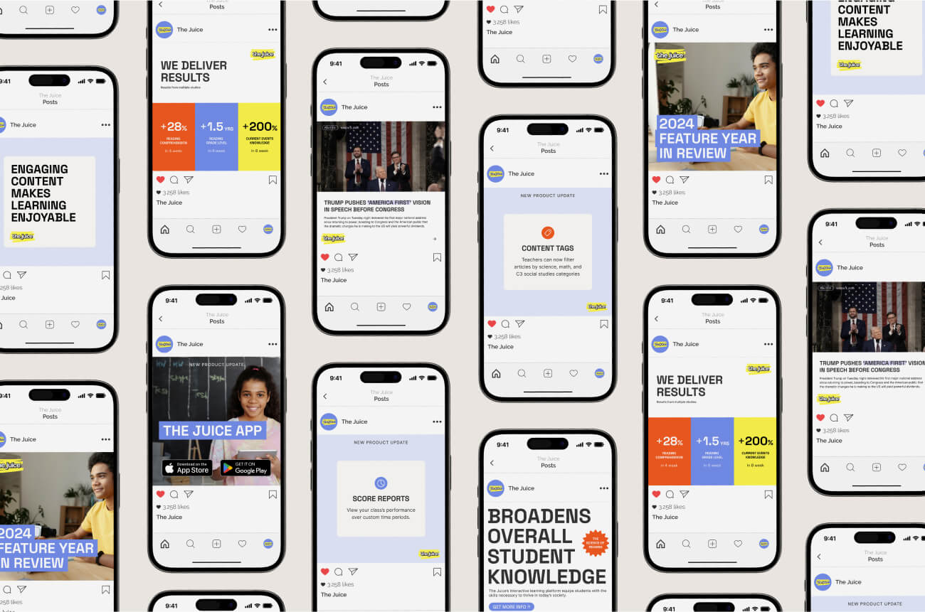
At an early stage, design is not decoration. It is a tool for thinking, testing, and decision-making. It helps you communicate your idea clearly to investors. It helps you validate assumptions with potential users before you build too much. It often surfaces gaps that point to missing research, unclear positioning, or unresolved user needs.
Design also plays a critical role in trust. Especially for pre-revenue products that ask for time, personal data, or emotional buy-in before delivering value. A confusing or careless experience does not just slow people down. It introduces doubt.
This is why bad design is not a cosmetic problem. It increases risk. Risk that users misunderstand what you are offering. Risk that investors struggle to see the opportunity. Risk that you move forward with false confidence instead of real validation.
Pre-revenue design is not just about building a first version of the product. It is about reducing uncertainty before your decisions get expensive.
When you invest in design at the pre-revenue stage, you are not paying for perfection or scale. You are paying for a few very specific outcomes.
First, design should make the product understandable. Someone unfamiliar with your idea should be able to grasp what it is, who it is for, and why it deserves trust without extra explanation.
Second, design should reduce cognitive and emotional load. A good early experience minimizes hesitation, unnecessary decisions, and second-guessing. This matters even more when users are already stretched or cautious, but it applies to any product asking for time or commitment.
Third, design should support validation and learning. It should help you test assumptions, spot confusion, and surface gaps before they turn into expensive mistakes. At this stage, design is a tool for learning, not something you lock in forever.
If design is not doing at least one of these things, it is probably not the right investment yet.
One of the fastest ways to overspend on design is to budget by deliverables. A logo. A full brand system. A complete product design. When you think this way, everything starts to feel equally necessary, even when it is not.
A more useful approach pre-revenue is to budget by priority. Not what assets you think you need, but what job design needs to do for you right now.
Tier 1 is not a checklist. It depends on what you are trying to prove or move forward.
For some founders, this means having enough designed to support an MVP, a demo, or a proof of concept. That might look like a handful of essential screens, a clickable prototype, or a clearly designed core flow that developers can start building from.
For others, a full build is not the goal yet. A few well-chosen screens can be enough to communicate the idea, test assumptions with users, or pitch to investors.
The same applies to brand. At this stage, you rarely need a full identity system. What you often need is a lightweight version of one. A clear creative direction, a logo, a small color palette, and basic visual rules that express positioning and intent. Something strong enough to feel credible and coherent, without pretending it is final.
Think of this as an express version of brand and product design. It is not permanent. It is designed to support clarity, trust, and learning now.
What makes these investments non-negotiable is not their size, but their impact. They reduce the risk of building the wrong thing and help people understand and engage with your idea.
These are things that can usually wait without blocking progress.
Additional features beyond the core flow. Expanded brand assets. Extra screens or pages that add completeness but do not change understanding, validation, or decision-making.
They are not wrong to want. They are just rarely the most important use of budget pre-revenue.
This is where early-stage budgets often disappear.
Animations added for delight rather than clarity. Perfecting edge cases before the main experience is validated. Designing every possible screen as if the product were already scaled.
These details have a place later. Early on, they often create the illusion of progress without actually reducing risk.
When you budget this way, design stops being an all-or-nothing decision. It becomes a series of intentional choices. You are no longer asking whether you can afford design. You are asking what level of design is actually needed to move forward right now.
One of the most common fears I hear from pre-revenue founders is that hiring a designer means committing to something big. A long engagement. A full rebrand. A complete redesign that drains the budget before the product even has a chance to prove itself.
It does not have to work that way.
Design can be scoped to match where you are. In many cases, the smartest investment is not more design, but more focused design.
That might mean designing one critical user flow properly instead of touching every screen. It might mean improving onboarding so people understand the value faster, rather than redesigning the entire product. Sometimes the highest-impact work is strengthening messaging before adding features that only increase complexity.
These kinds of investments pay off because they improve understanding at the moments that matter most. They help users, investors, and even you as a founder make decisions with less hesitation. They also give you better signals about what is working and what is not.
At this stage, you are not paying for volume or completeness. You are paying for direction. Direction about what to build next, what to test, and where deeper investment will actually matter.
When design is approached this way, it stops feeling like a risky leap. It becomes a controlled step forward, grounded in learning rather than polish.
Healthy design work at the pre-revenue stage starts with honesty. Not polished confidence, not perfect plans, but real context.
That means being clear about your actual budget, not the ideal one. About your runway and how long you realistically have. And about your stage, including what is still uncertain, messy, or unproven.
Good designers do not expect perfection at this point. In fact, most of the value comes from working inside those constraints, not pretending they do not exist. When a designer understands your reality, they can help you scope work that makes sense instead of pushing toward something you are not ready to support.
The mindset to avoid is treating design as a temporary cosmetic fix. Phrases like “we’ll just make it pretty for now” or “we’ll fix the UX once we have users” often lead to wasted effort and false signals. They assume design is separate from how the product actually works, which it never really is.
A more useful question is simpler and more honest: what is the most meaningful improvement we can make with what we have right now?
That question invites collaboration. It keeps expectations realistic. And it turns design into a shared problem-solving process rather than a performance.
Cutting back on design can feel like the responsible choice when budgets are tight. But in practice, cutting too far often shifts the cost rather than removing it.
When early design is unclear or careless, the signals show up quickly. Users hesitate, struggle to get started, or drop off without saying why. Founders often assume the problem is marketing, acquisition, or even the idea itself, when in reality the experience never earned enough trust to begin with.
First impressions carry more weight when you are pre-revenue. You do not yet have momentum, social proof, or a brand people recognize. The experience has to do more of the work on its own.
Rebuilding trust later is almost always more expensive than establishing it early. It usually means reworking flows, rewriting messaging, redesigning screens, and trying to win back confidence that was lost quietly.
This does not mean you need more design. It means you need the right design at the right moment. Design that reduces doubt instead of creating it. Design that supports understanding and confidence before asking users to commit.
Being pre-revenue does not mean you are behind. It means you are building under constraint, which is exactly where thoughtful design matters most.
You do not need to pretend you are bigger than you are. You do not need a perfect brand, a fully designed product, or every decision locked in. What you do need is enough understanding and direction to move forward without burning trust or runway.
That is how I work with founders. Through focused, weekly design sprints that meet you where you are and adapt as things evolve. We decide what matters most right now, design only what supports that goal, and leave the rest for later. No bloated scopes. No all-or-nothing engagements.
I primarily work with femtech, family tech, and wellness brands because trust, credibility, and emotional care are not optional in these spaces. But the principle is the same everywhere. Pre-revenue does not mean under-designed. It means designed with care, intention, and respect for the people you are building for.
If that approach resonates, we should talk.